Design comparison
Solution retrospective
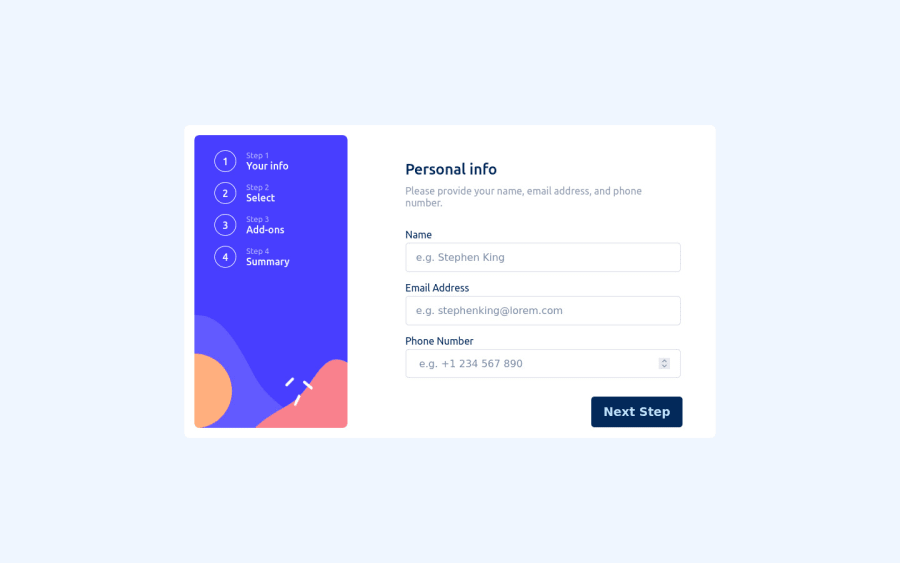
in this challenge I learn at and search a lot, this complete form took me two weeks plus to complete it, I welcome and any reviews and comments
Community feedback
- @lgorvinPosted almost 2 years ago
Hi Adeolu, good job on completing this project. Very impressive for Vanilla JS and CSS. The responsiveness is great and works perfect.
I did notice that when the page is full screen, the next step and go back buttons are not in the correct place. When you go back to page one whilst in full screen after going through the other pages then 2 next step buttons appear.
I'd personally make some changes to the size of the fonts especially on the add-ons page as it appears a bit cramped.
You should try out some frameworks, would definitely help to widen your expertise.
Marked as helpful0
Please log in to post a comment
Log in with GitHubJoin our Discord community
Join thousands of Frontend Mentor community members taking the challenges, sharing resources, helping each other, and chatting about all things front-end!
Join our Discord
