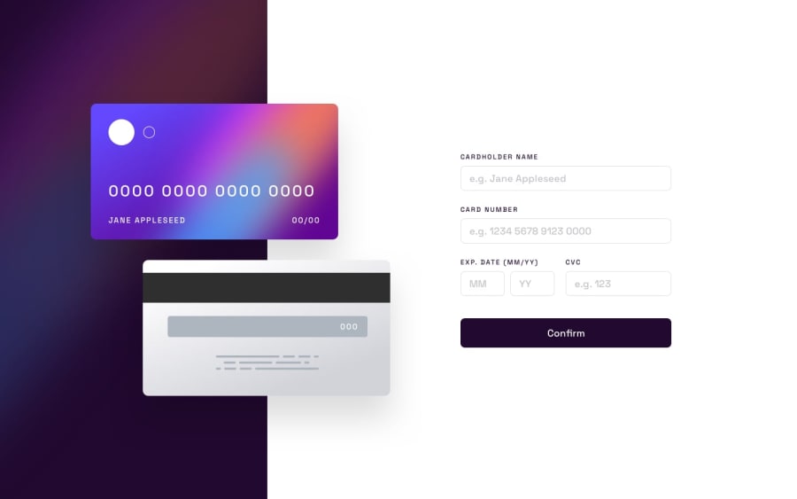
Design comparison
Solution retrospective
Hello community , I have completed another frontend mentor challenge. For sure , I've learnt few new things.
I would be happy , if you see something has to be improved , please don't hesitate and leave a feedback.
Thanks in advance.
Community feedback
- @lgorvinPosted about 2 years ago
Great job! It all looks great. A suggestion to improve the functionality would be to stop users from being able to input numbers into the cardholder's name and letters into the card number input etc...
Marked as helpful1@cbserraPosted about 2 years ago@MohammedDuke
To continue @lgorvin's comment, check out the following
inputattributes:Your Javascript
check...()functions are also very similar -- you could probably refactor the code to be one function which takes in an object to evaluate/update.Clicking 'Confirm' button after submitting the card data should bring the user back to an empty form.
Marked as helpful0@MohammedDukePosted about 2 years ago@cbserra thanks for your review
about input attr i already know them but i love to use js ,because i was in army for long time and was away from programing so forget about js
i will update confrim button thanks for notice me
but could you mind to tell me more about one function which take in an object to evaluate
0
Please log in to post a comment
Log in with GitHubJoin our Discord community
Join thousands of Frontend Mentor community members taking the challenges, sharing resources, helping each other, and chatting about all things front-end!
Join our Discord
