leonardo reis
@leonardo9245All comments
- @2saucy@leonardo9245
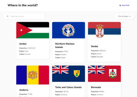
I really liked your solution you did a great job, but there are some points that you could improve, some that I noticed:
- the cards are with different sizes.
- the header is too big for mobile screens.
- it would be nice if you added the option to see all the countries in your filter by region, because when I change the region there is no option to see all the countries again, would have to reload the page again to see all the countries.
- @leonardo9245@leonardo9245
hi @fidellim thanks for your feedback, I have already provided the changes, but for some reason is not updating here on the site.
- @TBanda27@leonardo9245
Hi, I'm a beginner too, but I can give you some tips.
first: all page content must contain reference points, example
-body- -header- This is the header -/header- -nav- This is the nav -/nav- -main- This is the main -/main- -footer- This is the footer -/footer- -/body-
for this project, use at least -main- and -footer-
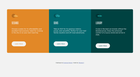
second: use only one main reference point, for example just a -h1-, for the other tags use -h2-, only subtitles. this should solve some of your problems already.
third: remove '"srcset" from your image, this attribute is required when used in .-source- -picture-
good luck.
Marked as helpful


