Design comparison
Solution retrospective
Any feedback particularly on accessibility is highly welcome
Community feedback
- @leonardo9245Posted almost 4 years ago
Hi, I'm a beginner too, but I can give you some tips.
first: all page content must contain reference points, example
-body- -header- This is the header -/header- -nav- This is the nav -/nav- -main- This is the main -/main- -footer- This is the footer -/footer- -/body-
for this project, use at least -main- and -footer-
second: use only one main reference point, for example just a -h1-, for the other tags use -h2-, only subtitles. this should solve some of your problems already.
third: remove '"srcset" from your image, this attribute is required when used in .-source- -picture-
good luck.
Marked as helpful0@TBanda27Posted almost 4 years ago@leonardo9245 thanks pal. Let me make the changes forthwith
0 - @grace-snowPosted almost 4 years ago
Hello
Those buttons should be anchor tags. They would trigger navigation not perform an action (like toggle visibility of something or submit or form, that's when a button would be used)
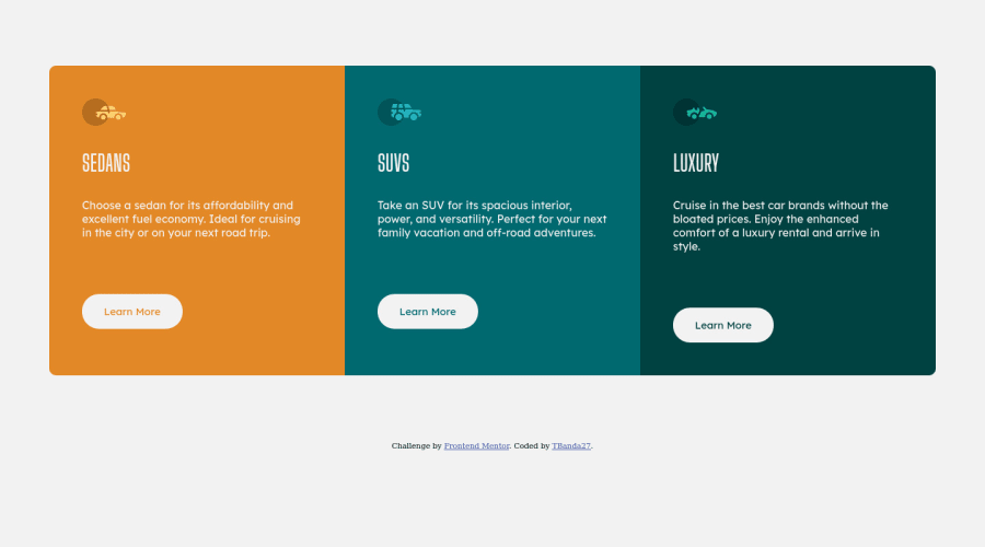
If you add a max-width to the component it will look closer to the design too
Happy coding!
0
Please log in to post a comment
Log in with GitHubJoin our Discord community
Join thousands of Frontend Mentor community members taking the challenges, sharing resources, helping each other, and chatting about all things front-end!
Join our Discord
