Skip to content
Learning paths
Challenges
Solutions
Articles
Unlock Pro
Log in with GitHub
Profile
Overview
Solutions
9
Comments
0
kwokkw
@kwokkw
Follow
All solutions
Submitted 11 months ago
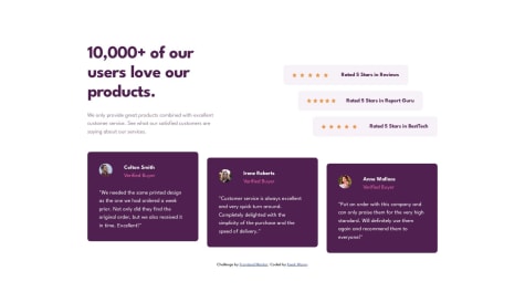
Social proof section responsive using basic html and css
HTML
CSS
1
4
0
Submitted 12 months ago
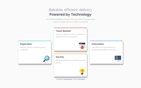
four card feature using basic html and css
HTML
CSS
1
7
0
Submitted 12 months ago
product-preview-card-component using basic html and css
HTML
CSS
0
6
1
Submitted 12 months ago
Stats Preview Card Component using basic HTML and CSS
HTML
CSS
0
4
0
Submitted 12 months ago
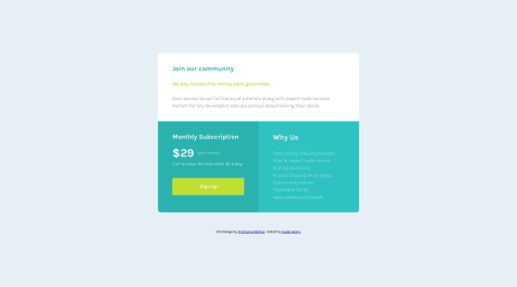
Order Summary Component using basic HTML and CSS
HTML
CSS
2
3
0
Submitted 12 months ago
Responsive Single Price Grid Component Using Basic HTML and CSS
HTML
CSS
0
4
0
Submitted 12 months ago
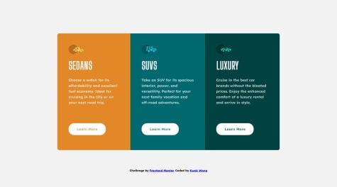
3 column preview card using basic HTML and CSS
HTML
CSS
1
5
0
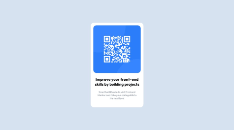
Submitted about 1 year ago
QR code component using basic HTML, CSS 2nd attempt
HTML
CSS
1
4
0
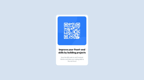
Submitted about 1 year ago
QR code component using basic HTML, CSS
HTML
CSS
2
9
0
