Design comparison
Solution retrospective
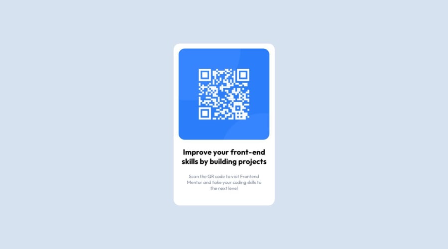
I found difficult to determine the size (width, height) of the container for the card during the challenge. Therefore, I hard coded the size of it. I would love to heard feedback on getting the right size. How can I handle this situation better? I also was not sure if I should use padding or margin.
Any additional comment/advise or related information will be greatly appreciated!
Community feedback
- @Mazz100Posted about 1 year ago
Hello, your work looks great good job, as for your question about fixed width I had exactly the same approach on my end, I used margins and width with pixels but this was bad practice so I will write down what I learned from this solution:
HTML
- You can remove the class used for main element as it describes itself and can be used directly inside of CSS.
- I read that linking the font or any outsourced content inside HTML and you can do that by copying the google-font link provided for the font and then use it in CSS.
CSS
- You need to use max-width and define a rem number instead of fixed width.
- Remove all the margins as its also not ideal to measure distance.
- Change the grid type to column display and remove
place contentreplace it withjustify-content, align-item
I see more hard coded numbers and also absolute position is very bad in this first solution so if you don't want the footer showing up just use
display:none.Feel free to checkout the discord community it helped me a lot. Good luck :)
Marked as helpful2@kwokkwPosted about 1 year agoHi @Mazz100,
Thanks for your reply! I could not figure out the a better approach on the width and height so I use hard coded numbers. I definitely need more development on this.
Great advice on the display of my footer! Thank you!
0 - @Islandstone89Posted about 1 year ago
Hi. You're using a
<main>, which many beginners tend to forget/be unaware of. And you have descriptive alt text. Well done. Here are some tips to make your solution better:HTML:
- The text in the
<footer>needs to be wrapped in a<p>.
CSS:
-
It's common to use lowercase letters on Custom Properties.
-
You can keep the
place-content: center,. Even though many use Flexbox to center the card, it's also possible to do it using Grid, and it's actually 1 line less of code. However,heighton thebodyshould bemin-height. -
Font-size should never be in px. Instead, use rem.
-
Remove the fixed width on the card. You rarely want to set fixed dimensions, except for sometimes on icons. Do add a
max-widthin rem to prevent it from getting too big on larger screens. -
<img>should havemax-width: 100%instead ofwidth. -
Change the margin on the image to
margin: 0 auto;. -
Add some padding on the
.containerto get the space between the image and the edge of the card. -
Put
text-align: center;on the body. Then, all the text will inherit that value from their ancestor(body). -
Remove the
position: absolute;on thefooter. If you don't want that text to show, remove it from the HTML altogether. -
Remove the media query. In this challenge, there is no need for one.
Good luck!
Marked as helpful0@kwokkwPosted about 1 year agoHello @Islandstone89,
Thanks for your great advice. I made couple changes accordingly. Below are the questions came up while marking the changes.
- I added a
max-widthon the card. But how to determine how many rem should be used to prevent it getting too big? - With the
max-width: 100%on the<img>, the image becomes relatively small to the design. How should I solve this problem.
Thank you for any input! Any related information/resources will be appreciated!
1@Islandstone89Posted about 1 year agoIf you open DevTools (press F12), you can toggle the "device toolbar" at the top, and select "responsive". Then adjust the viewport and see what works best. I think I used 20rem.
Regarding the image...actually, I want to correct myself a bit. Don't have any margin on the image at all. To center the image, use Flexbox on the
.container:display: flex; flex-direction: column; align-items: center;0@kwokkwPosted about 1 year agoHi @Islandstone89,
Thanks for your advice again. I figured out why my image was relatively smaller. I put down a smaller width attribute in the
imgelement in the HTML file. Lesson learned. Thanks a lot!1 - The text in the
Please log in to post a comment
Log in with GitHubJoin our Discord community
Join thousands of Frontend Mentor community members taking the challenges, sharing resources, helping each other, and chatting about all things front-end!
Join our Discord
