kristinakasalova
@kristinakasalovaAll solutions
- Submitted 4 months ago
Responsive Four elements using flexbox
- HTML
- CSS
I struggled with keeping the card titles within card borders when changing screen size. When shrinking the screen, the cards get proportionally smaller while the title gets pushed up outside the upper border. I'm not sure how to stop it and only keep the title within the card lines.
- Submitted 6 months ago
Blog preview card using simple CSS3
- HTML
- CSS
I noticed that the image in the mobile version is supposed to be cutout of the overall image, however despite the fact I tried to use
object-fit: cover;attribute that was supposed to solve it, it doesn't seem to work. Any suggestions would be appreciated. - Submitted 7 months ago
Social Links Profile plain HTML/CSS
- HTML
- CSS
I feel like importing fonts is something I need to dive into more even though I keep re-reading the documentation each time, I don't feel like I know what I'm doing.
- Submitted 7 months ago
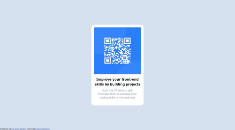
QR code HTML | CSS
- HTML
- CSS
Alignment, alignment, alignment. I feel that despite my efforts there is room left for improvement and I will be immensely happy if you share best practice with me.
- Submitted 9 months ago
Product card component using plain css3
- HTML
- CSS
In the end I am happy with the outcome, however, I would have expected a more elegant solution, some of the styles I perceive as brute-force (border radius for the .imgDt and .imgMb), but currently don't know how to manage better.


