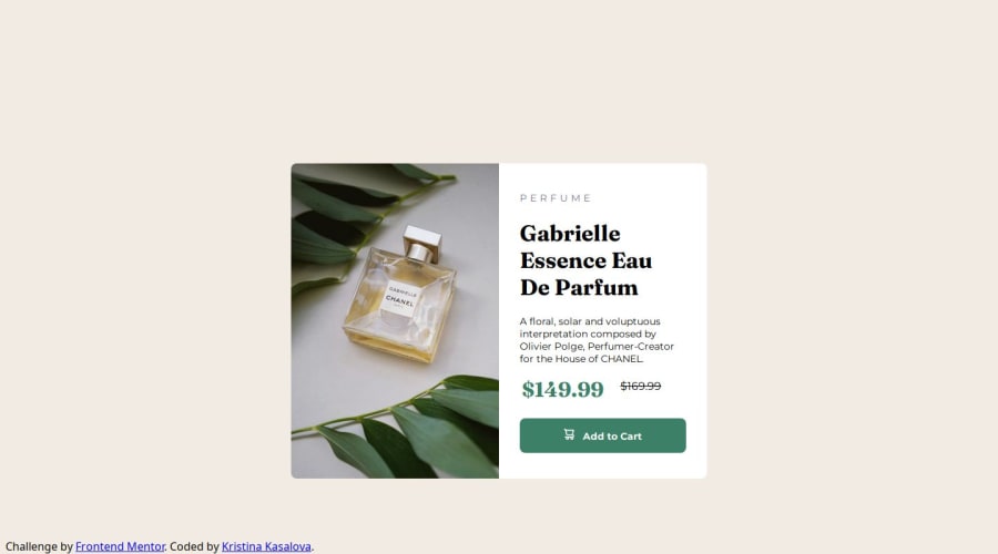
Design comparison
Solution retrospective
I used a basic CSS3 code, to check I am able to use it without other frameworks, just on it's own.
I aimed to be mobile first and struggled most with flexbox/grid decision and setup as it turned out I was using the media queries incorrectly (starting from desktop setup instead of mobile) and then corrected it.
What challenges did you encounter, and how did you overcome them?The biggest issues were: desktop vs mobile image (.pic .imgDt .imgMb) and its adjustments, fonts, position of the whole card (.wrap) and also rounded corners for the images.
What specific areas of your project would you like help with?In the end I am happy with the outcome, however, I would have expected a more elegant solution, some of the styles I perceive as brute-force (border radius for the .imgDt and .imgMb), but currently don't know how to manage better.
Community feedback
- @BDWNAVPosted 6 months ago
The solution looks almost identical to the original product, and the positioning is also very solid.
The responsiveness aspect is also working fine and the card sizes down according to screen size.
Overall very solid work.
0
Please log in to post a comment
Log in with GitHubJoin our Discord community
Join thousands of Frontend Mentor community members taking the challenges, sharing resources, helping each other, and chatting about all things front-end!
Join our Discord
