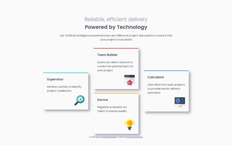


Design comparison

Solution retrospective
I'm glad I managed the cards to look relatively similar to the preview. I optimised for 2 sizes, mobile and desktop, however in future I would like to re-do it in a way that the design looks good on tablet or semi-large screens, i.e. changes to 2 column as opposed to currently showing 3 which is not as nice as I would like to.
What challenges did you encounter, and how did you overcome them?While I thought this would be just another simple challenge that would cement my CSS knowledge, I actually had a moderately hard time trying to figure out how to make all the images, texts and titles in the correct position. I ended up using flexbox styles, since all the other attempts failed.
What specific areas of your project would you like help with?I struggled with keeping the card titles within card borders when changing screen size. When shrinking the screen, the cards get proportionally smaller while the title gets pushed up outside the upper border. I'm not sure how to stop it and only keep the title within the card lines.
Community feedback
Please log in to post a comment
Log in with GitHub
Join our Discord community
Join thousands of Frontend Mentor community members taking the challenges, sharing resources, helping each other, and chatting about all things front-end!
Join our Discord