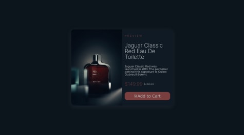
First small project following the completion of a front-end bootcamp to refresh some basics. Fairly random use of bootstrap and jQuery. I'm sure the code could benefit from some refactoring, but for now I'm just happy that it works.
Klaudia
@klaudiapalubskaAll comments
- @manonthemonSubmitted over 1 year ago@klaudiapalubskaPosted over 1 year ago
Hi
Good job with your project.
I glanced at your code and I want get your attention to some stuff.- From start try to focus make all layout responsive. For example
#thankyou-card{
    width: 320px;
    padding: 3vh;
    gap: 0.5vh;
}
Its nice because you use vh/vw but also you can define max-width instead width and make design responsive for smallest devices. Moreover better is use rem instead px. Thanks to this u can save a lot of time for getting tired with set properties for diffrent size devices. You only need set (for example):
html {
  /*Now 1rem = 18px*/
  /*If you are not set base, font-size is 16px and rem is references to the font-size*/
  font-size: 18px;
}
And now you can simple change all stuff in breakpoints of media queries.
-
You didnt use media queries so now your layout just mess up.
You really need take a look at this because is really important part of front-end. The most important rules of responsive website is:
- Fluid layouts - how I mention try make responsive web from start. If something doesnt work than you fix it in media queries.
- Responsive units - rem
- Flexible Images - set by %, width and max-width
- Media Queries - making breakpoints, you can check it the best of in internet.
-
Try not to use !important
if you really understand how cascade css works then you dont need to use this line of code. Its looks really dirty for other developers and they can think that you really dont knon whats going on in your code.
-
Better set class for all elements in css file. Its because id is for one element and class is for a plenty elements. So if you will be make more expanded project you want change all elements not one.
-
You cant permit user to go to the second part of card if user doesnt select a number.
I hope I could help. Have a nice day and more fun with new projects!
Ps. Sorry for language mistakes if there is. I hope thats all is understandable what I wrotte.
Marked as helpful1 - @LuanS0Submitted over 1 year ago
In this challenge, I learned practical fundamentals of flexbox and CSS styling. Another step of fundamental importance is the one related to semantic HTML, in order to make the code more readable.
@klaudiapalubskaPosted over 1 year agoI must admit that your project looks really cool!
tml, body, div, article, span, applet, object, iframe,
h1, h2, h3, h4, h5, h6, p, blockquote, pre,
a, abbr, acronym, address, big, cite, code,
del, dfn, em, font, img, ins, kbd, q, s, samp,
small, strike, strong, sub, sup, tt, var,
b, u, i, center,
dl, dt, dd, ol, ul, li,
fieldset, form, label, legend,
table, caption, tbody, tfoot, thead, tr, th, td {
	margin: 0;
	padding: 0;
	border: 0;
	outline: 0;
	font-size: 100%;
	vertical-align: baseline;
    box-sizing: border-box;
}
But I think is better use * in that case
* {
	margin: 0;
	padding: 0;
	border: 0;
	outline: 0;
	font-size: 100%;
	vertical-align: baseline;
    box-sizing: border-box;
}
Marked as helpful1

