

Design comparison
SolutionDesign

Solution retrospective
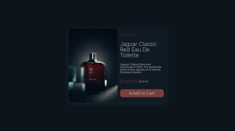
In this challenge, I learned practical fundamentals of flexbox and CSS styling. Another step of fundamental importance is the one related to semantic HTML, in order to make the code more readable.
Community feedback
Please log in to post a comment
Log in with GitHubJoin our Discord community
Join thousands of Frontend Mentor community members taking the challenges, sharing resources, helping each other, and chatting about all things front-end!
Join our Discord