keltiek
@keltiekAll solutions
- Submitted 7 months ago
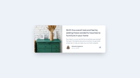
Article preview component (Tailwind CSS / Vanilla JS)
- HTML
- CSS
- JS
I couldn't crop the images the same way as in the screenshots of the challenge. I don't know how bad is my Tailwind ;) Any feedback would be greatly appreciated.
- Submitted 8 months ago
Interactive Rating Component (Tailwind CSS, Vanilla JS)
- HTML
- CSS
- JS
Any feedback is welcome, especially on Tailwind CSS. ;)
- Submitted 8 months ago
FAQ accordion (Tailwind CSS, no JS)
- HTML
- CSS
- JS
I used grid to display all the questions/answers. I wanted to rely on md:max-w-[524px] but with that there was a slight change in width when I unfolded the answer. I couldn't find a solution and I used a fixed value in the end (md:w-[524px]). Is there a way to avoid this resizing?
Also I tried to apply some animation when the answer appears but I was unable to get it working. And I don't know why :(
I tried things like: transition duration-300 group-open:opacity-100 opacity-0 on the paragraph of the answer, but no visible animation...
I tested with hover: instead of group-open: and then I can see the animation. group-open: is fullfilled (opacity is set to 100 when paragraph is visible...). Maybe I'm missing something obvious.
- Submitted 8 months ago
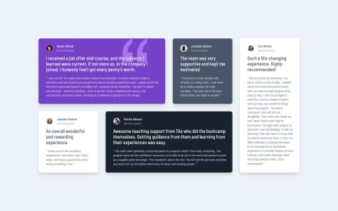
Testimonials grid section (Tailwind CSS)
- HTML
- CSS
I always end up by adding margin/padding here and there. Maybe there is a better way...
If someone with experience in Tailwind and CSS could give me some directions, I would be forever grateful ;)
- Submitted 8 months ago
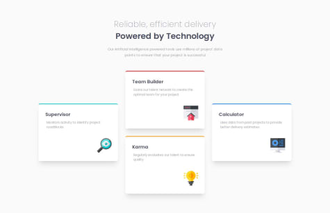
Four card feature section (Grid and Tailwind CSS)
- HTML
- CSS
I used absolute positions for the icons, but maybe I'm missing something simpler?
Is it possible to do the 4 cards in that pattern with Flexbox only? (And still have this intermediate state with 2x2?)
If someone with experience in Tailwind and CSS could give me some directions, I would be forever grateful ;)
- Submitted 8 months ago
Product preview card component (Tailwind CSS, messy md?)
- HTML
- CSS
I added md: with margin and padding here and there... But it doesn't feel that great...
If someone with experience in Tailwind and CSS could give me some directions, I would be forever grateful ;)
- Submitted 8 months ago
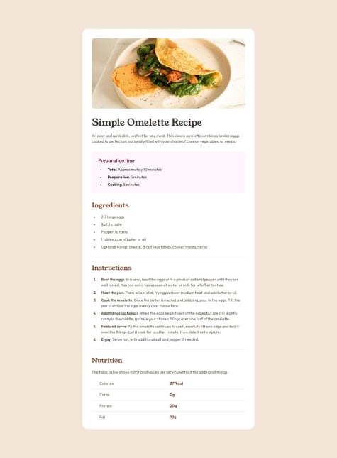
Recipe page (TailwindCSS)
- HTML
- CSS
For the table at the bottom, I would think would be perfect, but somehow I guess that's not valid. If I do the border myself, I couldn't manage to make it longer than the text.
I don't think this is the right way:
``
Also I guess there is probably a better way to have the right amount of space between the columns content without using fixed values...
For the bullet list, I couldn't manage to have the bullet aligned in the middle vertically, and again I feel my div inside is just a workaround to add some left padding...
`
Total: Approximately 10 minutes...`
I would love to get some feedback!
ps: everything is in index.html, I'm using Tailwind CDN and set the config directly there.
- Submitted 8 months ago
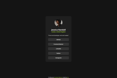
Social links profile (TailwindCSS)
- HTML
- CSS
Any suggestions on how I can improve on my solution are welcome. Thank you!
- Submitted 8 months ago
Blog Preview Card (TailwindCSS)
- HTML
- CSS
Any suggestions on how I can improve on my solution are welcome. Thank you!
- Submitted 9 months ago
Trying Tailwind
- HTML
- CSS
CSS/Flexbox and Tailwind... I guess I should have use gap between h1 and p?
