Design comparison
Solution retrospective
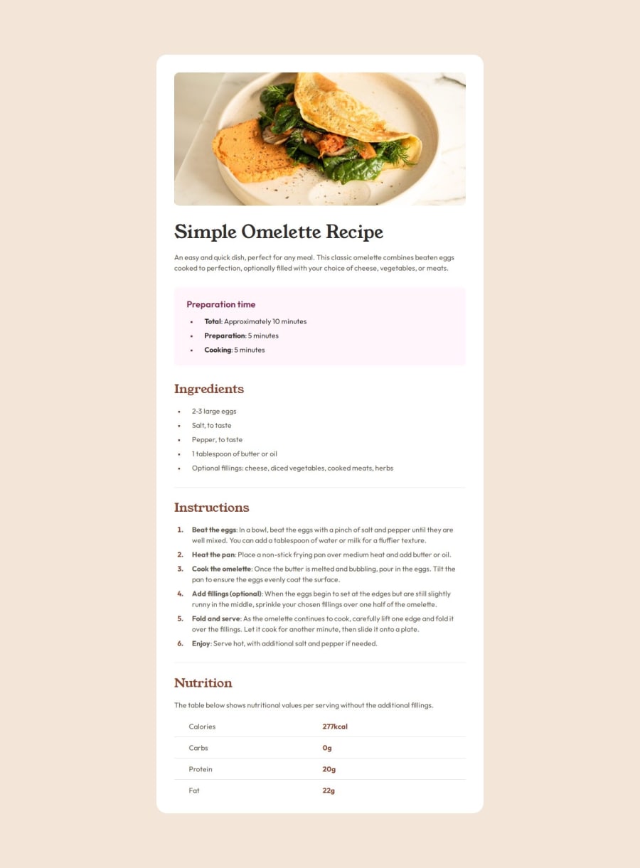
Doesn't look as bad as I thought:)
What challenges did you encounter, and how did you overcome them?I don't know enough about CSS and Tailwind.
I have the feeling I'm just doing workarounds on top of workarounds.
If someone with experience in Tailwind and CSS could give me some directions, I would be forever grateful ;)
What specific areas of your project would you like help with?For the table at the bottom, I would think would be perfect, but somehow I guess that's not valid. If I do the border myself, I couldn't manage to make it longer than the text.
I don't think this is the right way:
``
Also I guess there is probably a better way to have the right amount of space between the columns content without using fixed values...
For the bullet list, I couldn't manage to have the bullet aligned in the middle vertically, and again I feel my div inside is just a workaround to add some left padding...
`
Total: Approximately 10 minutes
...`
I would love to get some feedback!
ps: everything is in index.html, I'm using Tailwind CDN and set the config directly there.
Community feedback
- @keltiekPosted 8 months ago
Looks like something was off with code snippets in my previous comment. Anyway, I corrected the nutrition table at the bottom (with w-full mainly). So just missing bullet alignments... and better organisation I'm sure!
0
Please log in to post a comment
Log in with GitHubJoin our Discord community
Join thousands of Frontend Mentor community members taking the challenges, sharing resources, helping each other, and chatting about all things front-end!
Join our Discord
