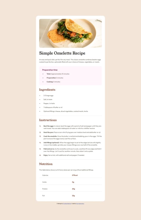
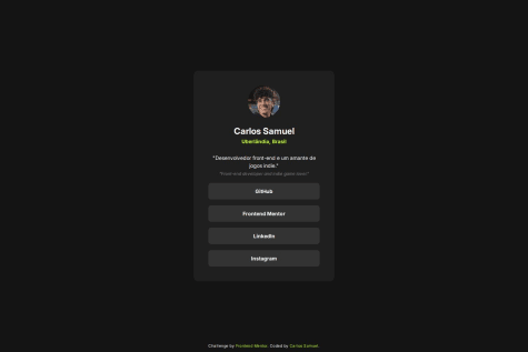
I think it looks alright! We'll see how close it is to the design lol but I think the desktop version is quite close in size and structure. I'm proud of figuring out the slight problem I originally encountered with the JavaScript tat didn't allow different data from the JSON to appear.
jevcenkokozlovska
@jevcenkokozlovskaAll comments
- @moonji-spoonjiSubmitted about 1 month agoWhat are you most proud of, and what would you do differently next time?
- @AlinggggSubmitted about 1 month agoWhat challenges did you encounter, and how did you overcome them?
Javascript is okay. This is the hardest page I have styled so far
@jevcenkokozlovskaPosted about 1 month agoerror 404 trying to access challenge
0 - @BluordeSubmitted about 1 month agoWhat are you most proud of, and what would you do differently next time?
I learnt much about Javascript while looking up the script necessary for this solution,
What specific areas of your project would you like help with?I have not yet mastered the position attribute and relative units in Css. The position of the popup button and the toggle button are both unsatisfactory because of this.
@jevcenkokozlovskaPosted about 1 month agoGood job! It'll be great to check how "social links" block (when clicked) behave when you change screen sizes like shortenning screen width.
0 - @kozel159Submitted about 2 months agoWhat are you most proud of, and what would you do differently next time?
Deepening my grid knowleage
What challenges did you encounter, and how did you overcome them?How to line up the columns
What specific areas of your project would you like help with?none
@jevcenkokozlovskaPosted about 2 months agoVery good structured css! P.S. It is not preferred to use h2 if there is no h1 in html.
0 - @grhmlrdSubmitted about 2 months ago
- @mostafa-hshSubmitted about 2 months ago@jevcenkokozlovskaPosted about 2 months ago
Very neat and precise css. Good job!
0 - @Casper-pelSubmitted about 2 months ago
- @CrtykwodSubmitted about 2 months agoWhat are you most proud of, and what would you do differently next time?
I'm proud that I was able to use CSS Grid to organize the layout efficiently.
I can't think of anything I would do differently next time, I believe that in this challenge I was quite successful.
What challenges did you encounter, and how did you overcome them?As incredible as it may seem, I had a problem with the underlining of `` not disappearing with
What specific areas of your project would you like help with?text-decoration: noneand I had to do some tests until I understood what was happening, the problem being that I had written "as" in my CSS, so the property was not being applied :vAny help is extremely appreciated, but I had to repeat term x many times, so if there is any way to do this in a simpler way, I would be very grateful to know!
- @ortiz-antonioSubmitted 2 months agoWhat are you most proud of, and what would you do differently next time?
I like organizing my project by using preprocessors to break down large HTML pages and CSS code.
What challenges did you encounter, and how did you overcome them?To be honest, improving was difficult, and I'm still learning continuously.
What specific areas of your project would you like help with?If you know of any accessibility issues or have suggestions on how I can improve the architecture, any feedback is welcome.
- @sakib-gitSubmitted 2 months ago@jevcenkokozlovskaPosted about 2 months ago
Good job ! Consider different class names instead of "one", "two", "three". They should reflect content of DIV.
0


