Not Found
Not Found
Not Found
Not Found
Not Found
Not Found
Not Found
Not Found
Not Found
Not Found
Not Found
Not Found
Not Found
Not Found
Not Found
Not Found
Not Found
Not Found
Not Found
Not Found

All comments

  • Tksmith 210

    @Tksmith-guru

    Submitted

    What are you most proud of, and what would you do differently next time?

    I'm proud of the fact that I'm growing and getting better at coding, it still surprises me that I was able to complete this in just 2 days. I wouldn't really do anything differently

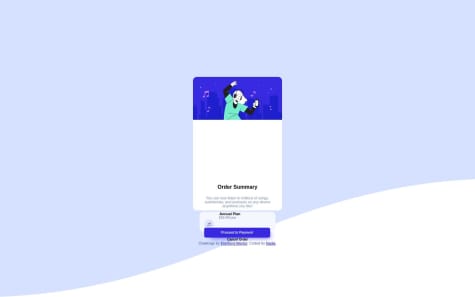
    What challenges did you encounter, and how did you overcome them?

    I had issues in centering and making the barcode responsive but I figured it out I had to start from scratch and write all the styles all over again

    What specific areas of your project would you like help with?

    I would need help in functionally,so far I'm quite competent in html and css but I would need help with innovating JavaScript in this

    Responsive barcode

    #accessibility#contentful#cube-css#styled-components#web-components

    1

    @jen67

    Posted

    "Hi Tksmith-guru,

    I noticed that the link to your live preview for the QR code challenge is broken. I followed the link to your GitHub page and realized that the issue might be with the repository name. Here's the corrected link: https://tksmith-guru.github.io/QR-code-Component-/

    Best regards,"

    2
  • @jen67

    Posted

    @mbongoelvis

    Hello mbongoelvis,

    I attempted to visit your website recently but encountered a 404 error indicating that the page could not be found. It might be worth checking the project link and making any necessary adjustments.

    Best regards,

    0
  • @jen67

    Posted

    Hi MSHCHEBETYUK,

    Your solution is fantastic! I noticed a small issue—the entire webpage content isn't showing, likely due to the overflow-y: hidden in your CSS. Consider checking and adjusting it:

    body, html {
        overflow-y: hidden;  /consider adjusting or removing this line of code/
    }
    

    Hope this helps improve your webpage display.

    Best regards.

    0
  • @jen67

    Posted

    Hi @Muhammed61699,

    I hope this message finds you well. I noticed that your site is currently not displaying.

    0
  • Pradeep S 10

    @pradeeps033

    Submitted

    Padding is a bit confusing to me is there a way to use padding in this to make it easier? And if someone could explain how it works it would be really helpful. If I have done any mistakes or if there is any way to improve myself the suggestions are much appreciated. Thanks!

    @jen67

    Posted

    Hi @pradeeps033,

    Your solution to this coding challenge is beautiful. Regarding your questions about the use of padding: Paddings are spaces added inside the content of an element, while margins are spaces outside an element that control its position in relation to other elements.

    For a more in-depth understanding, you can check out this resource:

    w3schools

    Marked as helpful

    0
  • @Rrdesh07

    Submitted

    1]I was not able to center the image without using flexbox , could anyone suggest any other idea to do it ? any suggestions are welcome .

    @jen67

    Posted

    Hi @Rrdesh07,

    Your code and card design are well done! To center an image without using flexbox, you can try using the text-align property on the parent container and set margin: 0 auto; for the image. This centers the image horizontally within its container. Here's an example:

    .card {
      text-align: center;
    }
    
    
    img {
      max-width: 100%;
      display: block;
      margin: 0 auto; /* Center the image horizontally */
    }
    
    Feel free to give it a try, and let me know if it helps!
    

    Marked as helpful

    2
  • @jen67

    Posted

    Hi Pragathi567,

    Your solution to this challenge looks amazing! 👏 Just a quick heads-up: I noticed that your image isn't displaying. Consider adjusting your paths; if both your image and HTML file are in the same folder, try using this code:

    <img class="img" src="avatar-jessica.jpeg" alt="avatar-jessica">
    

    Keep up the great work! 🚀

    0
  • @jen67

    Posted

    "Nice work, Omar! Your coding solution is great. Just a heads up, the image isn't displaying. Check and adjust the relative path when you get a chance. Keep it up!"

    consider using this since the html code and the images are in the same folder

     <img src="image-product-desktop.jpg">
     <img src="icon-cart.svg">
    

    Marked as helpful

    0
  • @jen67

    Posted

    Great job raufahamed You did great in coding this card challenge. However I noticed that your card image does not look balance. To balance it consider using this code snippet.

    img{
      max-width: 100%;
      display: block:
    }
    

    and removing the width set to the on the .img

    .img {
      border-radius: 12px;
      padding: 4px;
      width: 300px;  //consider removing this line
    }
    

    To learn more about responsive images you can also check out this website [w3schools] (https://www.w3schools.com/howto/howto_css_image_responsive.asp)

    Keep up the fantastic work

    Marked as helpful

    0
  • @jen67

    Posted

    Well done Nabin Katwal

    Your solution to this challenge is excellent. However, I have a suggestion that can help you centre your card.

    body{
        display: flex;
        flex-direction: column;
        min-height: 100vh;
        justify-content: center;
       align-items: center;
    }
    

    well done once again

    Marked as helpful

    0
  • @jen67

    Posted

    Hi Nadia,

    Kudos on the impressive website! For a subtle enhancement, try adding a custom cursor and a hover effect to your buttons. This quick addition can boost user engagement. Consider the following CSS:

    button {
      cursor: pointer;
      transition: background-color 0.3s ease;
    }
    
    button:hover {
      background-color: #yourDesiredColor;
    }
    

    Feel free to adjust colors to match your design. Great job overall! Let me know if you need any assistance.

    0
  • @jen67

    Posted

    "Olá! Eu percebi um pequeno problema com a tag de imagem. Em HTML, as barras inclinadas para frente / são usadas no caminho do arquivo. Então, tente atualizar sua tag de imagem assim:

    <img src="images/image-qr-code.png" alt="">

    Dê uma tentativa, e isso deve exibir sua imagem corretamente. Se tiver alguma dúvida ou precisar de mais ajuda, sinta-se à vontade para perguntar! Continue com o bom trabalho!"

    Marked as helpful

    0
  • Yousef 50

    @ousey-ousey

    Submitted

    first: i dont know why but when images folder is inside a folder the github pages did't read it that alone make me spine around second: i need advice about the mobile media i don't know why it does not work last: i want to make when i show one questions and click on other the first disappear and the second come out

    @jen67

    Posted

    Great job on your code! 🚀 If you're interested in diving deeper into accordions, check out these quick resources:

    1. CodePen Example
    2. W3Schools Tutorial
    3. YouTube Video

    Happy coding, and keep up the good work! 👏

    Marked as helpful

    1
  • @jen67

    Posted

    Hi there!

    I hope this message finds you well. Firstly, I wanted to commend you on the great work you've done with your code👌👏—it's evident that you've put thought and effort into it.

    I noticed a small tweak that could enhance the overall presentation. Your layout seemed a bit tilted and too close to the top. As a suggestion, I played around with some flex properties applied to the body tag, and I believe it significantly improved the visual appeal. Here's the snippet I tried:

    body {
      display: flex;
      flex-direction: column;
      align-items: center;
      justify-content: center;
      min-height: 100%;
    }
    

    This adjustment ensures a more balanced and centered appearance. Feel free to give it a try and let me know what you think. Keep up the fantastic work—I'm looking forward to seeing more of your coding brilliance!

    Marked as helpful

    0
  • @jen67

    Posted

    Great effort!👏

    I've got a small suggestion for you to enhance your design. It seems like the illustration image might not be perfectly placed. Consider using the following CSS code to ensure it's positioned correctly:

    .ilustracao {
        width: 100%;
    }
    

    This tweak should help improve the overall presentation. Keep up the good work! 👍

    Ótimo esforço!👏

    Eu tenho uma pequena sugestão para você melhorar seu design. Parece que a imagem da ilustração pode não estar perfeitamente posicionada. Considere usar o seguinte código CSS para garantir que ela seja posicionada corretamente:

    css Copy code

    .ilustracao {
        width: 100%;
    }
    

    Essa pequena alteração deve ajudar a melhorar a apresentação geral. Continue com o bom trabalho! 👍

    0
  • @jen67

    Posted

    Hello,

    Great effort on your code! I noticed that the image isn't displaying properly, and it might be due to an issue with the file path. Take a moment to double-check the path for your image. Making sure it's accurate will undoubtedly enhance the visual appeal of your project.

    Keep up the good work.

    Marked as helpful

    2
  • @jen67

    Posted

    Hi there, I must say, well done! Your work looks impressive. However, I noticed a couple of areas where some adjustments could enhance the overall presentation:

    1. For the h2 element, consider adding some breathing space at the top. You can achieve this by including the following CSS rule:

    h2 { margin-top: 2rem; }

    2.The avatar appears a bit large; you might want to consider reducing its size. You can achieve this effect with the following CSS:

    .avatar{ width: 4rem; height: 4rem; }

    These are just suggestions to further refine your already impressive project. Keep up the great work! If you have any questions or need clarification on any point, feel free to reach out.

    Best regards

    Marked as helpful

    0
  • @jen67

    Posted

    Hey Manuel,

    Great job on the code! 👏 Just a quick suggestion: consider adding hover effects for both your navigation button and links.

    For the button, try this:

    .button:hover { /* Desired hover effect */ }

    And for the nav links:

    nav a:hover { /* Desired hover effect */ }

    Keep up the awesome work!

    1
  • @jen67

    Posted

    Your solution is lovely. Well done. For mobile view, you can use media query. example you can change the flex-direction of your card to column and then adjust the width of your of your image and the other container to fit properly.

    @media only screen and (max-width: 600px){
    .card{
    flex-direction: column;
    }
    }
    

    You can learn more about media querries: here

    Also to change the image to the mobile image on smaller screens you can enclose your images in a picture tag. example.

    <picture>
    <source media="(max-width: 700px)" srcset="./images/image-product-mobile.jpg"/> //where this represents your mobile view image
    <img src="./images/image-product-desktop.jpg" alt=" "> //where this represents your desktop view image
    </picture>
    

    This is a link to learn more about this: picture-tag

    Marked as helpful

    0