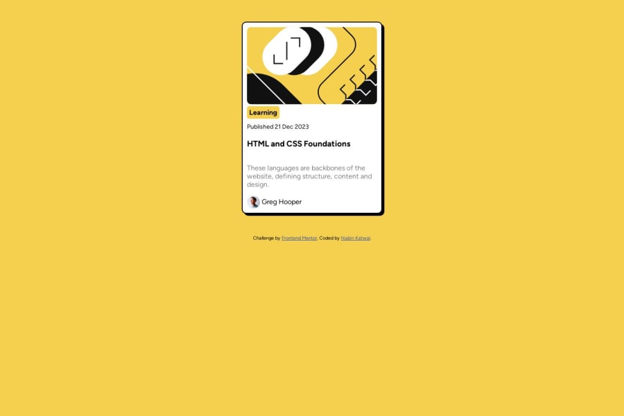
Design comparison
Community feedback
- @rayaattaPosted 10 months ago
Hello 👋Nabin Katwal, congratulations on completing this challenge 🎉
I have some suggestions you might find interesting.
1 Every html document should have a main tag that encloses the main page contents change
<div class="card">To<main class="card">This will change nothing visually but it makes all the difference. It improvesaccessibility and SEO
You can learn more about the main tag in this article
2 Divs carry no semantic value therefore you should replace
<div class="date" >Published 21 Dec 2023</div>with
<p class="date>Published <time datetime="2023-12-21">21 Dec 2023</time></p>This carries semantic value and therefore improves user experience for people using assistive technology such as screen readers because the time tag is machine readable.
I hope this helps 🙃
Happy coding ✌️
Marked as helpful0 - @jen67Posted 10 months ago
Well done Nabin Katwal
Your solution to this challenge is excellent. However, I have a suggestion that can help you centre your card.
body{
    display: flex;
    flex-direction: column;
    min-height: 100vh;
    justify-content: center;
   align-items: center;
}
well done once again
Marked as helpful0
Please log in to post a comment
Log in with GitHubJoin our Discord community
Join thousands of Frontend Mentor community members taking the challenges, sharing resources, helping each other, and chatting about all things front-end!
Join our Discord
