P
@NikitaVologdinSubmitted 6 months ago

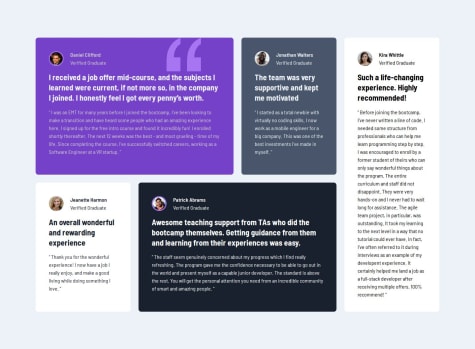
The code is clean, but there are a few areas that can be improved
Remove height: auto because when I enter the page after a successful authentication, the container's height is insufficient, causing a vertical scrollbar to appear. I tried removing height: auto, and the original layout remains the same without the scrollbar.
When checking for the presence of error messages via the button, you could use add and remove instead of toggle. I believe the error message should persist when the input format is incorrect, but toggle will cause the error message to disappear if I press the button an even number of times, even when the input is still incorrect.
Perhaps you could add code to clear the input fields after a successful validation, instead of keeping the previous data in the fields.
I decided to remove padding bottom from article for now. because have not found way how to match "share arrow icon" with block which appears after click on button and align that icon with content in appearing block. Unfortunately if add same padding-bottom value to the block in creates disproportional look for content vertical alignment.
Overall, it's excellent. It seamlessly switches between different screen devices without any errors. Here are a few areas I noticed that could be improved:
Another interesting thing is that when the screen size is reduced to below 300px, it applies the desktop styles again, which is also something that can be adjusted
In terms of CSS, it might be helpful to use a CSS reset more frequently, followed by the :root selector, and then proceed with other style settings.
For using font-family, consider using CSS variables, like: --ff-montserrat: 'Montserrat', sans-serif; --ff-fraunces: 'Fraunces', serif;
gap: 1rem; only needs a single semicolon.
Good use of flex-basis helped me solve my layout problems.
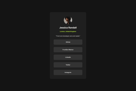
Pros: The overall design is clean and well-organized, and the cursor icon on hover is very cute.
Areas for Improvement:
The background color set for @media screen and (max-width: 375px) is somewhat abrupt; using a darker color might enhance consistency. The top and bottom of the cards tend to stick to the edges of the page. Consider adding padding to the body to avoid this issue.
For me, I would set text-align: center on <p class="card-header--role">"Front-end developer and avid reader."</p> to ensure that the text remains centered when the screen is resized and the line breaks.
That's just my solution to this project; your design is good enough!
Did not write in Markdown. Writing in Markdown would help clearly identify any issues and the process of styling.
HTML
The implementation of CSS variables is truly commendable, as it enhances the maintainability and flexibility of the code. Additionally, the overall structure of the code is remarkably concise, which not only improves readability but also ensures that the design adheres to the principles of responsive web design. This adherence guarantees that the layout remains intact and visually appealing across various screen sizes and devices, preventing any issues related to misalignment or distortion. Overall, the combination of these practices contributes to a robust and user-friendly web experience.