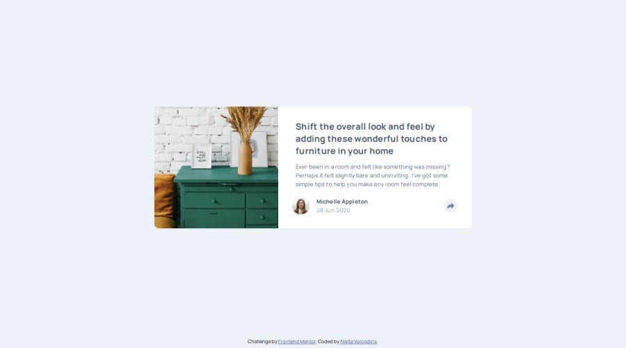
Design comparison
Solution retrospective
I decided to remove padding bottom from article for now. because have not found way how to match "share arrow icon" with block which appears after click on button and align that icon with content in appearing block. Unfortunately if add same padding-bottom value to the block in creates disproportional look for content vertical alignment.
Community feedback
- @jen067Posted 6 months ago
Overall, it's excellent. It seamlessly switches between different screen devices without any errors. Here are a few areas I noticed that could be improved:
- Perhaps you could add more padding to the button, as the icon area currently seems a bit too large, making the icon appear off-center within the container.
- It might be due to the transition setting, but on mobile devices, when the text "share" disappears, you can clearly see it gradually fading out instead of disappearing instantly. This might be something that can be improved.
Marked as helpful0P@NikitaVologdinPosted 6 months ago@jen067 Thank you for your feedback! It is constructive. I fixed all your suggestions.
0
Please log in to post a comment
Log in with GitHubJoin our Discord community
Join thousands of Frontend Mentor community members taking the challenges, sharing resources, helping each other, and chatting about all things front-end!
Join our Discord
