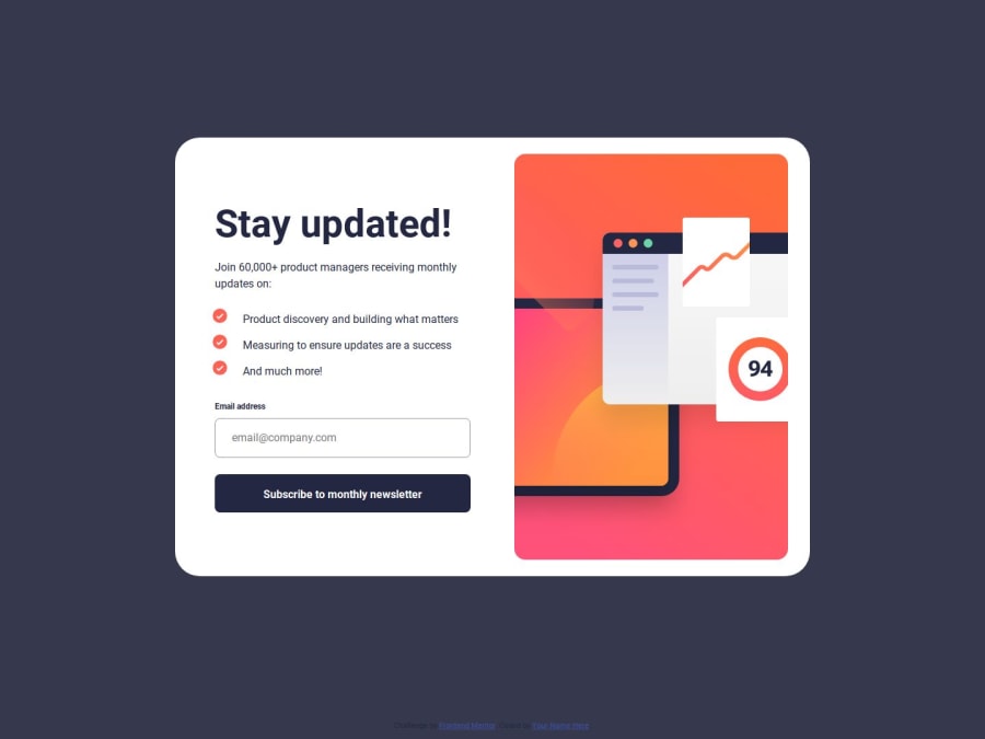
Newsletter sign-up form with success message
Design comparison
Community feedback
- @jen067Posted 6 months ago
The code is clean, but there are a few areas that can be improved
-
Remove height: auto because when I enter the page after a successful authentication, the container's height is insufficient, causing a vertical scrollbar to appear. I tried removing height: auto, and the original layout remains the same without the scrollbar.
-
When checking for the presence of error messages via the button, you could use add and remove instead of toggle. I believe the error message should persist when the input format is incorrect, but toggle will cause the error message to disappear if I press the button an even number of times, even when the input is still incorrect.
-
Perhaps you could add code to clear the input fields after a successful validation, instead of keeping the previous data in the fields.
Marked as helpful0 -
- P@NikitaVologdinPosted 6 months ago
@jen067 Jen you have made the best review I ever had. Thank you so much! According to your suggestions:
- I decided to add min-height and keep height auto simultaneously. Thank you for noticing the scroll bar. I removed it after your suggestion.
- You are right! I refactored these functions. To use toggle was the wrong idea.
- I added a clear input field function after your suggestion.
You have significantly improved my markup. Please let me know if you ever would like to get a review from me on any challenge. Please have a great day =) Best, Nikita
0
Please log in to post a comment
Log in with GitHubJoin our Discord community
Join thousands of Frontend Mentor community members taking the challenges, sharing resources, helping each other, and chatting about all things front-end!
Join our Discord
