@asimsaeed353Submitted about 1 month ago
What are you most proud of, and what would you do differently next time?
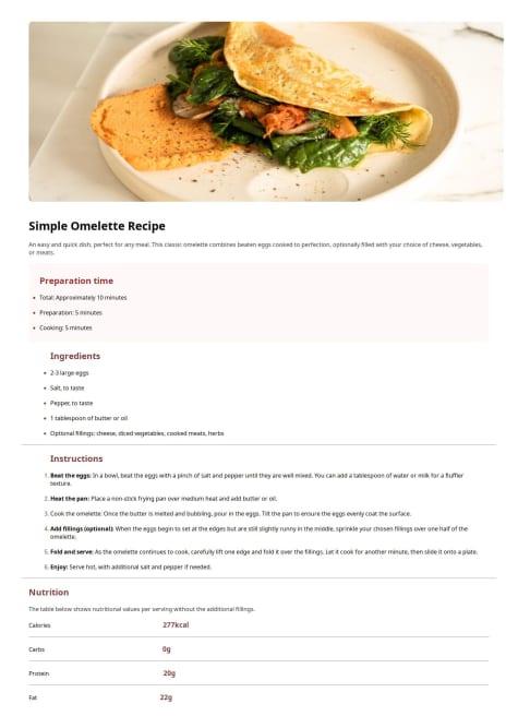
Using JavaScript to manipulate HTML DOM and populate content dynamically.
What specific areas of your project would you like help with?In this solution, I stored data in a JavaScript Array. I would like help with any function of fetching data from data.json to populate data dynamically using JavaScript.