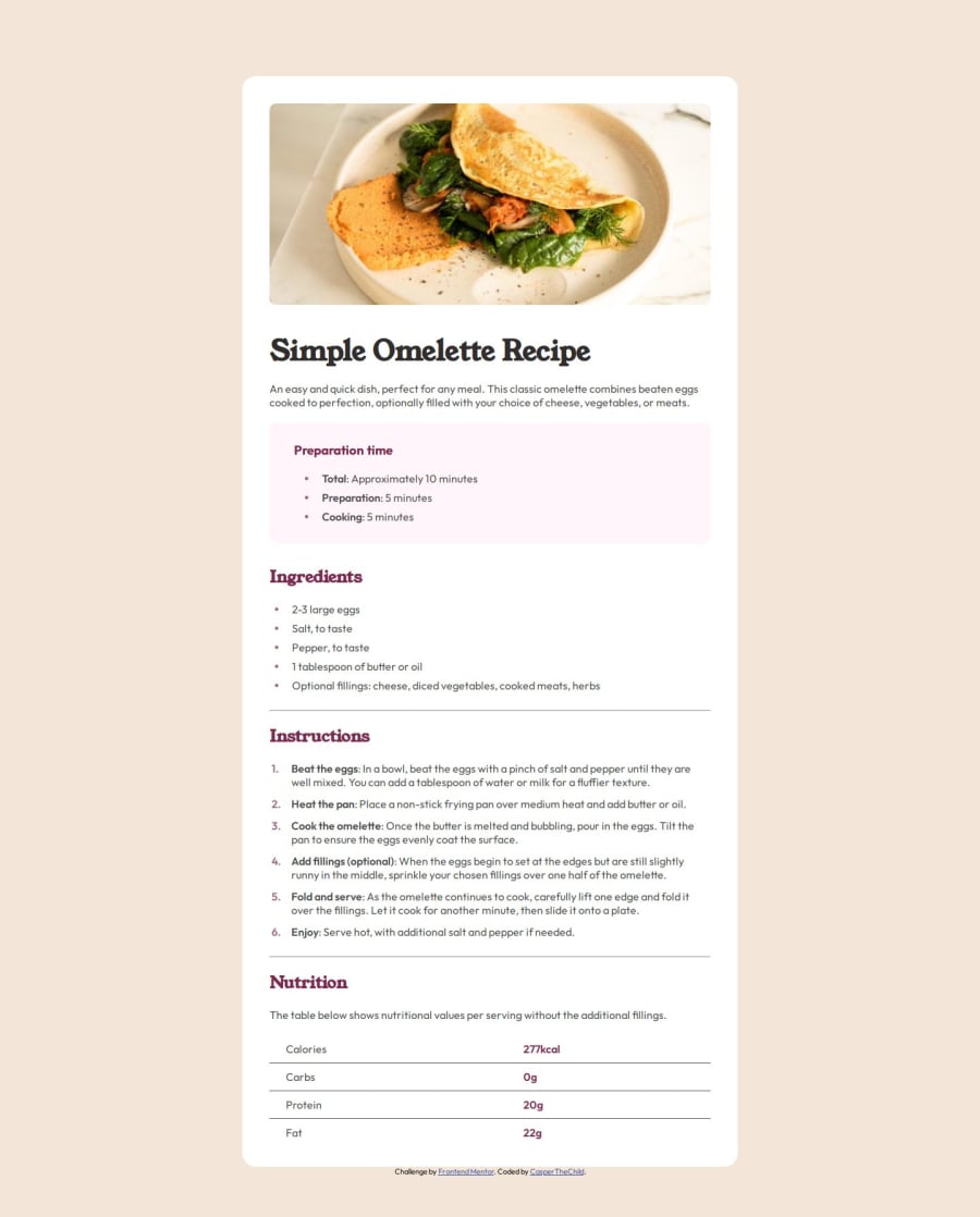
Recipe card page using CSS flex
Design comparison
Solution retrospective
I'm proud of finding out how to style sign in lists and how to use pseudo elements.
What challenges did you encounter, and how did you overcome them?I haven't known how to style the left signs of lists, but I found out that I had to use pseudo-elements, as CSS doesn't allow changing their appearance.
What specific areas of your project would you like help with?I couldn't change some elements' opacity, even though I wrote '!important'; Can you help me?
Community feedback
- @AdrianoEscarabotePosted 6 months ago
Hi CasperTheChild, hope you're doing well! I loved how your project turned out, but I’ve got a few suggestions that could be useful:
I noticed that your card is growing a lot at higher resolutions, to avoid this we can use
max-width:body .recipe-card { max-width: 760px; min-height: 100px; margin-top: 7rem; padding: 2.5rem; background-color: var(---White); border-radius: 1.25rem; margin-bottom: 0; }By doing this we will have a better result, when the user has devices with a larger screen.
The rest is fantastic.
Hopefully, you'll find it helpful. 👍
Marked as helpful1 - @iamprincetjPosted 6 months ago
Congrats on finishing this challenge, Great work! Restrain from using !important, instead I suggest you try CSS specificity method. I think it will also fix your opacity not working problem. Goodluck!
1
Please log in to post a comment
Log in with GitHubJoin our Discord community
Join thousands of Frontend Mentor community members taking the challenges, sharing resources, helping each other, and chatting about all things front-end!
Join our Discord
