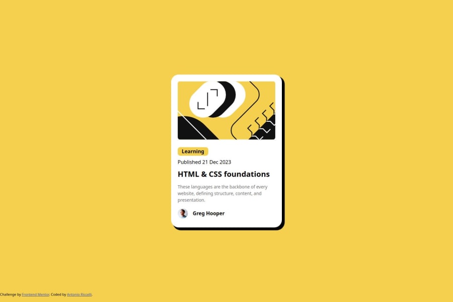
Design comparison
Solution retrospective
I'm proud that I managed to put something together that, at the very least, resembles what was provided.
I'm not sure about doing one specific thing differently, but this is making me realise that I probably need to go through a CSS course where I can review the core concepts from scratch, particularly regarding typography etc.
What challenges did you encounter, and how did you overcome them?I was very confused by how to implement the Figma design and what exactly the challenge was asking of me. There seemed to be specific PX sizes provided, but it also mentioned about having the font-size decrease in size based on screen size. I wasn't quite sure how to best approach this, but I put something together that seems to work.
What specific areas of your project would you like help with?I would like to understand better what the design was asking of me and how to implement that better in my code, particularly regarding typography.
Community feedback
- @iamprincetjPosted 7 months ago
Congratulations on your solution, nice work, everything looks great from my perspective. But I think the footer should be centered and try using rem for font sizes, 1 rem is equal to the default font size in the body, which is 16px, so with calculations you can get your desired font size. Overall, you did great, well done.
0
Please log in to post a comment
Log in with GitHubJoin our Discord community
Join thousands of Frontend Mentor community members taking the challenges, sharing resources, helping each other, and chatting about all things front-end!
Join our Discord
