@yudhaCodeSubmitted over 1 year ago
I wonder why Google Fonts cannot be applied.

I wonder why Google Fonts cannot be applied.
Hey, your solution looks great!
Did you try loading fonts with <link> in HTML and not with @import in CSS? It is the recommended way of loading fonts in order to speed up the page loading time.
Also, try wrapping your images in <figure> instead of generic <div> containers. It is good for semantic meaning, SEO, and accessibility.
Cheers, and happy coding!
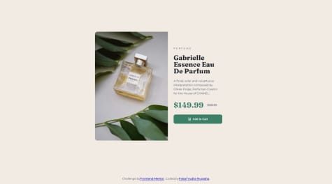
me ha quedado bastante parecido al diseno original
What challenges did you encounter, and how did you overcome them?aprender acerca de flexbox
What specific areas of your project would you like help with?codigo limpio
Looks great and clean!
Maybe you should consider deleting their footer thingy and flex-direction: column and the top container's margin-top in order for centering to work. Their footer/author stuff will only make it hard to align your solution with their footerless design.
Cheers, and happy coding!
The way I centralized the elements in the screen using Display flex, was it the best way to make it?
The TAGs I used on my HTML code are good, or should I use other TAGs to make my code cleaner?
I'm open to receive some pieces of advice as well as some constructive criticism. Thanks
Hey, it looks great!
As for HTML tags, you are missing the <main> tag for your top container. Also, it would be better to use <figure> for the image container instead of generic <div>.
Cheers!
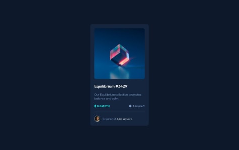
I couldn't quite figure out how to get the hover to work on the NFT image. I tried using :hover pseudo class and ::after pseudo element, but could not get it to work. Any suggestions on code quality or styling would be very much appreciated. Thank you!
Hey, excellent work!
For the NFT on hover issue, you can try my solution. First, give your NFT container position: relative. Then add the container with the "eye" image inside it. That new container should have position: absolute and opacity: 0, stretch it to match the outer container so it will match the NFT image in size. Now you can change its opacity to 1 and set the background color when you hover over it. Here is my solution:
https://github.com/floatingPebble/floatingPebble.nft-preview-card-component-FM.io
Let me know if I can help with something. Cheers!
Looks really nice!
I've noticed the following:
color from default black.<div> tags if possible, so in this case, you can use <main> tag on your main-container element.border-radius looks a little bigger than it should be. Maybe try setting it to 12px.I hope you find this helpful.
Cheers, and happy coding!