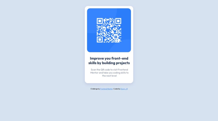
Design comparison
Solution retrospective
me ha quedado bastante parecido al diseno original
What challenges did you encounter, and how did you overcome them?aprender acerca de flexbox
What specific areas of your project would you like help with?codigo limpio
Community feedback
- @0xabdulkhaliqPosted almost 2 years ago
Hello there 👋. Congratulations on successfully completing the challenge! 🎉
- I have other recommendations regarding your code that I believe will be of great interest to you.
CSS 🎨:
- Looks like the component has not been centered properly. So let me explain, How you can easily center the component without using
marginorpadding.
- We don't need to use
marginandpaddingto center the component both horizontally & vertically. Because usingmarginorpaddingwill not dynamical centers our component at all states
- You already using
Flexboxfor layout, but you didn't utilized it's full potential. Just add this single following rule to properly center the component.
body { min-height: 100vh; }- Now remove these styles, after removing you can able to see the changes
.container {
margin-top: 40px;
}
- Now your component has been properly centered
.
I hope you find this helpful 😄 Above all, the solution you submitted is great !
Happy coding!
0@0xabdulkhaliqPosted almost 2 years ago@dusvimarin Glad you found it helpful ! 🤠
0 - @floatingPebblePosted almost 2 years ago
Looks great and clean!
Maybe you should consider deleting their footer thingy and
flex-direction: columnand the top container'smargin-topin order for centering to work. Their footer/author stuff will only make it hard to align your solution with their footerless design.Cheers, and happy coding!
0
Please log in to post a comment
Log in with GitHubJoin our Discord community
Join thousands of Frontend Mentor community members taking the challenges, sharing resources, helping each other, and chatting about all things front-end!
Join our Discord
