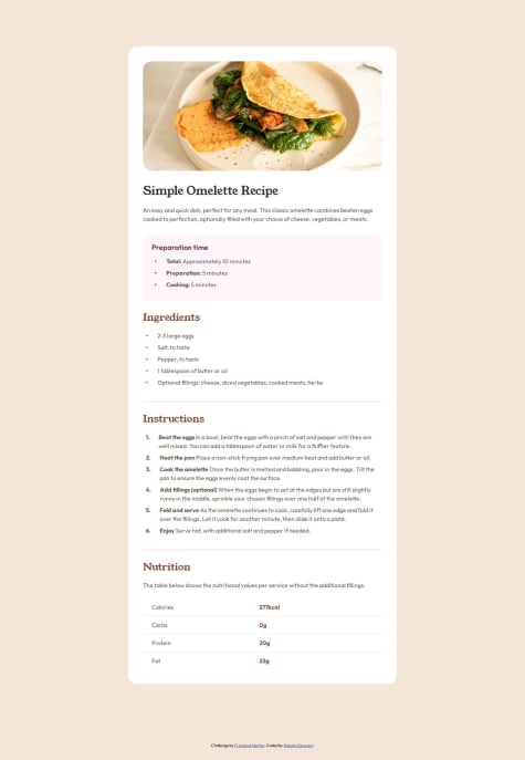
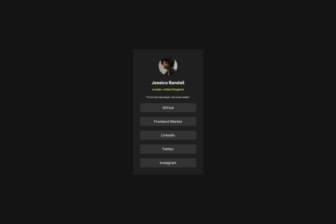
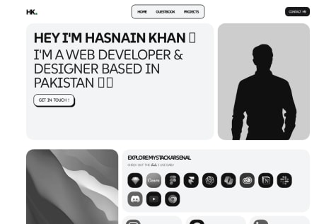
Implementing a responsive layout that works seamlessly across different devices and screen sizes is an accomplishment. Ensuring the card adapts well on mobile, tablet, and desktop adds significant value to the project. While the component might look great in one browser, ensuring it's flawless across all major browsers is crucial. Next time, you could invest more in automated testing or manual checks to avoid any compatibility issues.
What challenges did you encounter, and how did you overcome them?Ensuring that the product preview card looked perfect on various screen sizes (mobile, tablet, desktop) was a challenge. Getting the layout to adapt properly, especially when dealing with text overflow, image resizing, or grid/flexbox properties, required careful attention. To overcome responsive design challenges, I used CSS Grid and Flexbox strategically. Media queries were applied at specific breakpoints to ensure content was displayed appropriately on all devices. Tools like Chrome DevTools helped simulate different screen sizes during development.
What specific areas of your project would you like help with?Implementing smooth transitions or micro-interactions to enhance user experience. Optimizing the use of JavaScript or CSS animations to ensure they don’t affect performance negatively. Gathering and integrating feedback to better understand how real users interact with the component and identify areas for improvement. If the product card involves dynamic data (like updating price, rating, or availability), handling state management or adding interactive elements (e.g., hover, click events) efficiently can be a challenge. React, Vue.js, or even plain JavaScript. Help with optimizing event listeners, DOM manipulation, or improving performance for animations/interactions would be beneficial.


