
@gungkrisna17Submitted 7 months ago
Latest solutions
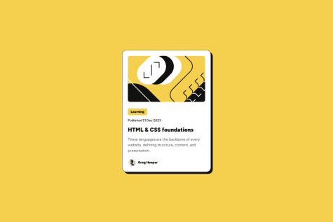
Social Links Profile
Submitted 6 months agoIs using display: grid with place-content: center the best way to center the card in this case?
Is it good practice in this situation to give the body a min-height of 100vh?
Latest comments
- @dannisoulPosted 6 months ago
You’ve done a great job.
I recommend avoiding completely black borders, especially when working on white backgrounds. Instead, use a less contrasting color or try adding some opacity.
0 - @DoggiLoLSubmitted 6 months ago
- @minimomo14Submitted 6 months agoWhat are you most proud of, and what would you do differently next time?
this challenge is fun as newbie like me! I start using figma for better mobile and desktop designs but I'm still struggle with how to make the image size more accurate.
if anyone have any advice that'd be great!
thank you in advance and happy coding y'all :)
What challenges did you encounter, and how did you overcome them?I did a lot of googling LOL
What specific areas of your project would you like help with?Struggle with the image :(
@dannisoulPosted 6 months agoAbout the image, I suggest giving it full width. Inspect the card width in the Figma resource, and you’ll notice it has a max-width regardless of the viewport width. Use that width, and also check the paddings and gaps inside the card. This will result in a more accurate design. However, you have done a pretty good job!
Marked as helpful0 - @minimomo14Submitted 6 months ago@dannisoulPosted 6 months ago
Great job, but I have some advice for you.
- Use the Figma resource to get the correct element sizing (width, height, padding, border radius, font size, etc.).
- Inspecting the Figma resource allows you to see everything related to the design system in more detail, like colors, typography, etc.
Marked as helpful0