Design comparison
Solution retrospective
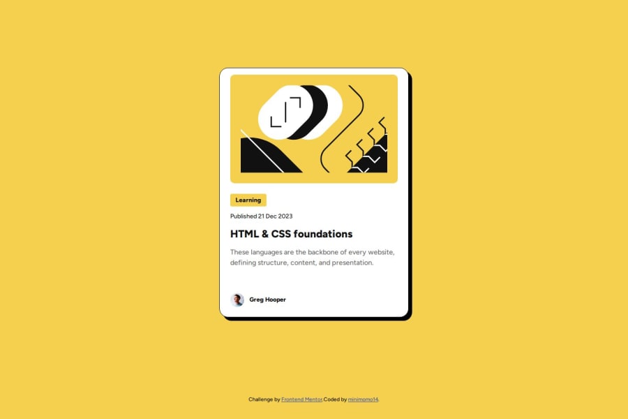
this challenge is fun as newbie like me! I start using figma for better mobile and desktop designs but I'm still struggle with how to make the image size more accurate.
if anyone have any advice that'd be great!
thank you in advance and happy coding y'all :)
What challenges did you encounter, and how did you overcome them?I did a lot of googling LOL
What specific areas of your project would you like help with?Struggle with the image :(
Community feedback
- @dannisoulPosted 6 months ago
About the image, I suggest giving it full width. Inspect the card width in the Figma resource, and you’ll notice it has a max-width regardless of the viewport width. Use that width, and also check the paddings and gaps inside the card. This will result in a more accurate design. However, you have done a pretty good job!
Marked as helpful0@minimomo14Posted 6 months ago@dannisoul thank you for your feedback! I'll definitely take your advice into account and update my solution accordingly. I really appreciate your help. :)
0
Please log in to post a comment
Log in with GitHubJoin our Discord community
Join thousands of Frontend Mentor community members taking the challenges, sharing resources, helping each other, and chatting about all things front-end!
Join our Discord
