Design comparison
SolutionDesign
Solution retrospective
What challenges did you encounter, and how did you overcome them?
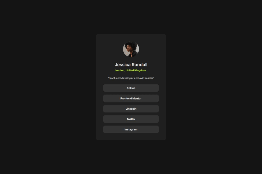
I had trouble matching the card's height, even though I matched the padding, gaps, and font sizes from the Figma resource.
What specific areas of your project would you like help with?Is using display: grid with place-content: center the best way to center the card in this case?
Is it good practice in this situation to give the body a min-height of 100vh?
Community feedback
- @Israel-AndreottiPosted 6 months ago
I did the same thing you did with the display grid and the body a min-height of 100vh, so I'd say that's a good option
1
Please log in to post a comment
Log in with GitHubJoin our Discord community
Join thousands of Frontend Mentor community members taking the challenges, sharing resources, helping each other, and chatting about all things front-end!
Join our Discord
