Good job doing this design! The course you're taking seems to be working! There's three things I'd change about your design:
CARD
The card element could have simply been a flex container. You can then use flex-direction: column to align all items from top to bottom, and use gap to separate them from one another instead of having to use margin-top or margin-bottom in some of the child elements.
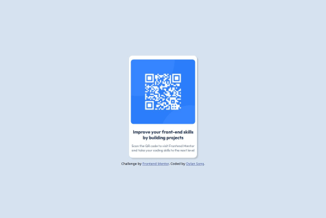
IMAGE
I can see that you're doing the trick by using background-image on a div. However, this would be much simpler if you simply replaced the div element for the img one. The styling would be almost (if not) the exact same. However, there's no real difference between the two, it's just something that would work better for accessibility than anything else.
PROFILE
The profile section is done using a table. To me, this seems a bit overkill, specially after reading that you're just learning flexbox, which could have been perfect for this section. There's two elements: img and p. You can completely remove the table and its corresponding elements and put both the image and the text inside a div element. Then, you can style it as follows:
.profile {
    margin: 0;
    display: flex;
    align-items: center;
}
This would place both elements in the same row, and align them to the center vertically.
Keep up the good work and happy coding!