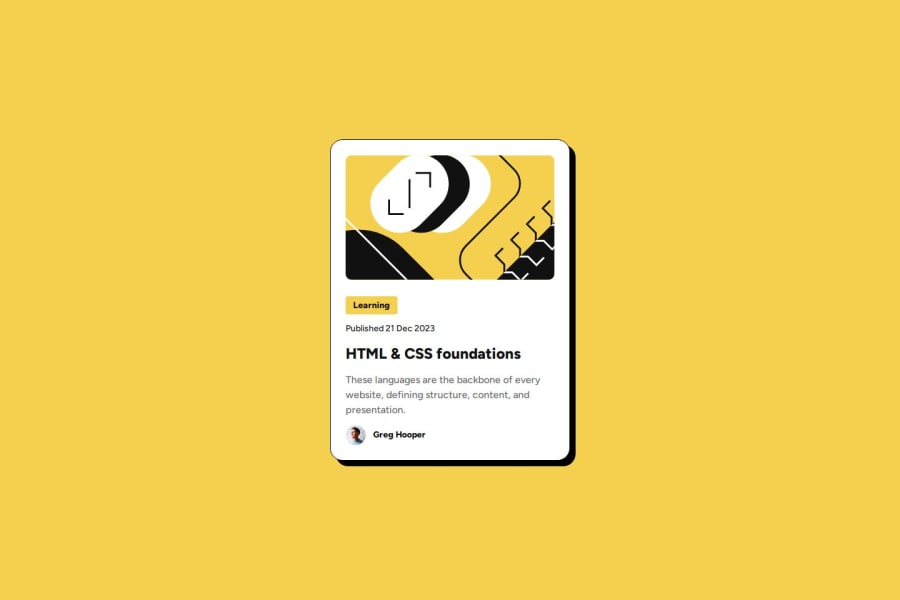


Design comparison

Solution retrospective
I completed this very quickly, in one sitting (less than 2 hours). It also matches the design perfectly.
What challenges did you encounter, and how did you overcome them?I did not know how to resize text dynamically without media queries. I found out about rem lengths, and how to use them to resize font based on the default browser size. I calculated my text-presets based on the browser default, and it works well.
What specific areas of your project would you like help with?I wonder if this is truly responsive. I used px lengths for padding and margins, using the spacing on the figma design. I feel there's a better way to do that, but I am not sure what it is.
Community feedback
- @damigandPosted 5 months ago
Hey there! First of all, amazing job completing the challenge! There's two things I'd like to point out about your design:
PX vs EM
There is no better or worse option, each has its own use, em and rem are generally very good with text sizing because they adapt to the screen in relation to parent or the browser's default text sizing. Using em for texts is helpful with accessibility too because the browser's default text size can be changed for people with sight issues. Pixels on the other hand, are generally really good for establishing explicit, robust and precise spacing between elements on the screen. In both cases, the use of css variables for spacing can make media queries easier because you can just change the variable, instead of changing every container or text with a specific spacing. I personally don't see any issue with the pixel spacing in your solution. Keep in mind, media queries have a purpose, there's no reason not to use them!
IMAGE PROPERTIES
There's one slight mistake in your solution regarding how the image adapts to smaller screens. If you look closely at the figma design, the image doesn't seem to get smaller as the screen size shrinks; instead, the image remains the same size, but as the container shrinks, you can see a smaller fraction of the image. This is done with a css property called
object-fit. I suggest experimenting with it, here's a source that you might find helpful.If you feel like you've learnt something with my comment, please mark it as helpful. Happy coding, Henry!
Marked as helpful2

Please log in to post a comment
Log in with GitHub
Join our Discord community
Join thousands of Frontend Mentor community members taking the challenges, sharing resources, helping each other, and chatting about all things front-end!
Join our Discord