

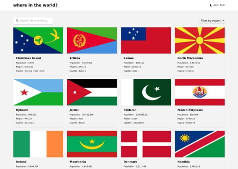
@mitkokazakovSubmitted about 1 year ago
Latest solutions
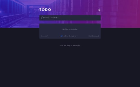
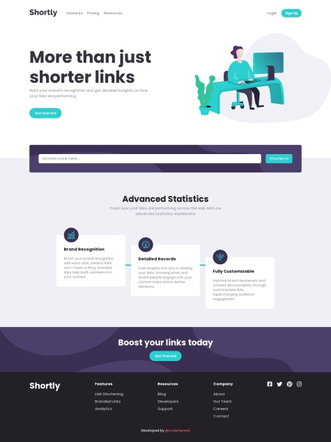
Full-stack Interactive Comments Section
#mongodb#next#typescript#tailwind-cssSubmitted over 1 year ago
Latest comments
- @coderSureshPosted about 1 year ago
Hey there, nice work.
The NaN you are seeing on the initial load for a second is because you are setting
nstate with the value oftimeValuewhen it is undefined.You can simply check if
timeValueis defined and set thenstate accordingly.For example: You can add following line below line number 28 of your
CounterCard.jsxif (!timeValue) returnIf you do this, you see noting for a second (for which you were previously seeing NaN) and then the timer starts.
Marked as helpful0 - @Joe-77Submitted over 1 year ago@coderSureshPosted over 1 year ago
Hey there Awesome work
I haven't viewed your code yet.
But looking at preview, I found a couple of issues.
First of all, the dark mode is not persisting when I reload the page. You can persist user-selected theme mode by storing it in the localStorage.
Another issue is, chips showing border country on details page are not showing properly. They are cutting from bottom. Maybe you can add margin bottom to the container so give it some white space.
And what I am going to write below this line is not necessarily a problem but I think it can be improved.
-
I think the shadow can be decreased but it's totally a personal preference.
-
Since some flags have more width and some have more height, it is hard to make all of them look good.
1 -
- @HaarithBinSaburSubmitted over 1 year ago@coderSureshPosted over 1 year ago
Hello there,
To put it simply, Flexbox is a one-dimensional tool while Grid is two-dimensional. With Flexbox, you cannot control both rows and columns simultaneously, whereas CSS Grid allows you to do so.
If you want to learn more about Flexbox and Grid, I recommend watching Kevin Powell's YouTube video where he explains these tools in detail. You can find the video at this link: https://www.youtube.com/watch?v=3elGSZSWTbM. Additionally, you may find it helpful to read the comments section below the video as many people have shared their thoughts and opinions on these tools.
Marked as helpful1 - P@nataliesmythSubmitted over 1 year ago@coderSureshPosted over 1 year ago
Hi there, great work.
I am seeing a couple of issues with your project.
First of all, your HTML has some validation errors. (You can validate your HTML here: https://validator.w3.org/)
The first issue is that we can't use any
<section>or<div>inside of the<ul>. In this case, you can remove the<section class='desktop-error'>and it will work fine.Another issue is that it is better not to use a trailing slash
/on a self-closing element. For example, you are using an input tag as<input type='text' ... />which can be used as
<input type='text' ... >You can read the reason here https://github.com/validator/validator/wiki/Markup-%C2%BB-Void-elements#trailing-slashes-in-void-element-start-tags-do-not-mark-the-start-tags-as-self-closing
The third issue is that we can't use
<span>as a child of<ul>. Instead, you can put<span>inside the<li>tag.For example, you are showing an error message as:
    <li>
            <input type="email" id="mail" name="user_email" placeholder="Your email address..."
              class="form-input border-round">
    </li>
    <span role="alert" id="emailError" aria-hidden="true">
              <em>Please provide a valid email address</em>
    </span>
But, it is better to do it this way,
<li>
            <input type="email" id="mail" name="user_email" placeholder="Your email address..."
              class="form-input border-round">
            <span role="alert" id="emailError" aria-hidden="true">
              <em>Please provide a valid email address</em>
            </span>
</li>
The final issue I am seeing is that the image is overflowing on smaller devices and that is because you are setting fixed width using rem unit.
I saw on line 75 of
style.cssthat you are settingmax-width: 100%;on img and picture tag. However, I saw no effect of using it.Instead, you can set
width: 100%;so that the image takes full width on the smaller screen and takes maximum35.45188remwhen the device width is larger than35.45188rem.This way you can make the image responsive.
Thanks.
Marked as helpful1 - @linomattosSubmitted over 1 year ago@coderSureshPosted over 1 year ago
Hey there, excellent work.
I didn't know anything like the Pixel Perfect extension existed. Thanks for this.
I have created a pull request on your repo to solve your issue with the hover state overlay and icon. You can find it here: https://github.com/retronauta/frontend-mentor-nft-preview/pull/1
Alternatively, you can look through my solution here: https://github.com/coderSuresh/nft-preview-card
And, if you don't feel like going through links, here is a general idea of how I did it.
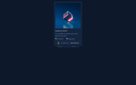
index.html- use img_container class - use custom css to display overlay on hover (in input.css) --> <div class="img_container relative flex cursor-pointer justify-center items-center h-fit my-6" > <!-- - making overlay with view icon - bg-transparent-cyan is a custom color from tailwind.config.js - that gets its value from css variable in input.css --> <div class="overlay absolute pointer-events-none top-0 hidden left-0 w-full h-full bg-transparent-cyan rounded-xl" > <div class="absolute top-1/2 left-1/2 transform -translate-x-1/2 -translate-y-1/2" > <img src="./images/icon-view.svg" alt="view icon" class="w-12" /> </div> </div> <!-- - we don't need any pointer events on this image - using pointer-events-none class --> <img src="./images/image-equilibrium.jpg" alt="Nft picture" class="rounded-xl pointer-events-none" /> </div>input.css:root { --transparent-cyan: hsla(178, 100%, 50%, 0.50); } /* make image overlay visible on hovering its parent div */ .img_container:hover .overlay { display: block; }tailwind.config.jsmodule.exports = { content: ['./dist/*.{html, js}'], theme: { extend: { colors: { .... 'transparent-cyan': 'var(--transparent-cyan)' //from css variable (to be used in html) }, fontFamily: { outfit: ['Outfit'], }, }, }, plugins: [], }Marked as helpful1 - @maelacudiniSubmitted over 1 year ago@coderSureshPosted over 1 year ago
Hey there, I am seeing an issue with your project.
When I type something into the search bar and press enter, a new chip is formed (that thing below the search bar with a cross icon).
If you wish, you can view my solution here, https://job-search-static.netlify.app/
0