


@nereahmSubmitted 3 months ago
What specific areas of your project would you like help with?
No he sabido aplicar el espaciado entre los números de la lista
Nothing specific, I think I have a good grasp of the concepts that are covered in this Getting Started learning track and I am ready to move on to more advanced challenges. That being said, any feedback is always welcome!
1) INSTAGRAM LINK ISSUE
I had a really annoying issue with the Instagram link that I would help with. For some reason, when I used the link href="https://www.instagram.com/coco.elizabeth_/", the browser added inline styling (color and text-decoration) to the <a> tag for the instagram social link item. I couldn't find anything online about why this was happening but it happened to me in both Chrome and Safari, and it happen on my local server as well as when I published the project on GitHub Pages.
Here is a screenshot of what was happening:
(Notice the purple, underlined instagram link)
This is the HTML I was getting when I inspected the code:
(Notice the added style attribute, which was not added to any of the other links)
<li class="social-link-item m-t-200">
   <a
     class="social-link-item-text text-preset-2 bold"
     href="https://www.instagram.com/coco.elizabeth_/"
     target="_blank"
     aria-label="Follow me on Instagram"
     style="color: rgb(206, 167, 212); text-decoration: underline;">Instagram</a>
</li>
Things I tried to fix it:
:visited CSS pseudo-class in the CSS - This did not work.Ultimate solution/workaround:
To fix the issue, I used a URL shortener and replaced the link with the shortened URL: href="https://tinyurl.com/coco-elizabeth-intsa".
While this workaround fixed the issue, I am still confused about why it was happening. If anyone has any ideas of what would have caused this, please let me know!
2) FIGMA ANIMATION/TRANSITION I found it difficult to get my hover effect to fade in and out exactly like the Figma prototype and I still don't think it's perfect. Does anyone have a good resource for CSS transitions/animations or how to export the animation properties from Figma to CSS without a developer plan? Is this even something you could do with a developer plan?
Apart from these two things, any feedback of how I can improve is always welcome :)
I would appreciate feedback on what libraries/frameworks/tools I could use to make this process faster and more in line with industry standards. Also, any feedback on accessibility best practices would be great.
No he sabido aplicar el espaciado entre los números de la lista
Hi! Great project. For your question about creating the space between the numbers and the list, here is how you could do it:
<li>s in the HTML by wrapping all of the text for each item in a <div>. For example:<li class="instructions__item"> <!-- wrap all of the text in a div here --> <div> <strong>Beat the eggs:</strong> In a bowl, beat the eggs with a pinch of salt and pepper until they are well mixed. You can add a tablespoon of water or milk for a fluffier texture. </div> </li>
/* Instructions styles */

.instructions__list {
/* remove default styling */
  list-style: none;
  margin: 0px;
  padding: 0px;
  /* initialize counter */
  counter-reset: css-counter;
}

.instructions__item {
 /* set the li item to display flex */
  display: flex;
  width: 100%;
  /* increment counter on each li */
  counter-increment: css-counter;
}

.instructions__item::before {
  /* add the counter using the before psuedo class  */
  content: counter(css-counter) ".";
  /* style the counter */
  min-width: 40px;
  padding-left: 8px;
  padding-right: 8px;
  box-sizing: border-box;
  color: hsl(14, 45%, 36%);
  font-weight: bold;
  height: 100%;
}

/* remove your `.instructions__item::marker` class  */
Hi Mohammed! Your solution shows you have a good grasp of CSS and HTML fundamentals. Specific strengths that stood out to me are:
To elevate your solution, here are a few suggestions:
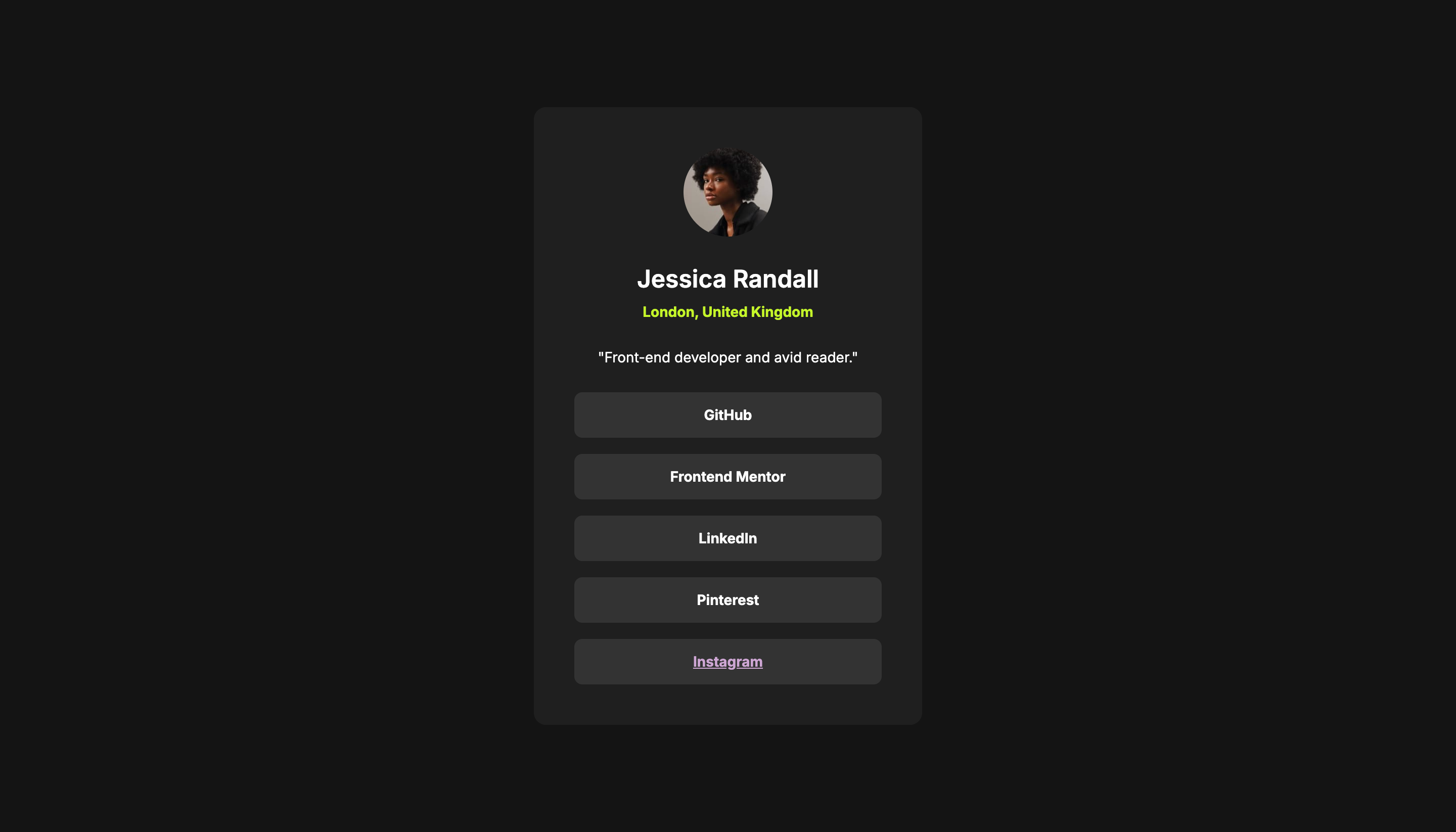
alt attributes to all <img> tags to improve accessibility. For example:<img src="image/avatar-jessica.jpeg" alt="Profile picture of Jessica Randall">
div elements for the social links, you could use <a> tags, since screen readers can recognize <a> tags as links, which helps users understand they can be followed to more content.--Green-body to something more descriptive and accurate, e.g. "--dark-background" or something more consistent with the style guide naming, e.g. `--grey-900, might be be more intuitive and reduce potential confusion.Great job!
I think I followed the styles guide pretty close and got the hover effect right.
What challenges did you encounter, and how did you overcome them?I was struggling with the margin/padding of mobile layout. I wanted to write mobile first. However, the card component was giving me issues with overflowing image and that was a time sinker. Eventually, I just stuck with it and try to finish the rest of the code instead of tinkering prematurely.
What specific areas of your project would you like help with?Any feedbacks or refactoring are welcome!
Great job!
To align more closely with the brief, you could add :focus, and :hover styling to the blog title to make it turn yellow, like you did with the active class. For example:
.title {
  font-size: var(--fs-base-l);

  & a:active, a:hover, a:focus {
    color: var(--color-primary);
  }
}
Hi Natentado! Your solution is great! Here are a few minor suggestions for improvement:
Responsive Design: The layout adjusts well across different screen sizes, maintaining a central alignment and appropriate scaling of the QR code image. Consider adding media queries to adjust the padding or margins on smaller screens to utilize space more efficiently. (e.g., there would be no padding on the iPhone SE, which has a viewport width of 320px)
Code Quality: The code is clean and well-structured. CSS properties are consistently ordered, which improves readability. To increase reusability, consider using CSS variables for colors and fonts.
Design Fidelity: While the implementation is generally in line with the original design, there are a couple of deviations to note:
qr-code-container component, which is not shown in your solution. Adding a CSS .drop-shadow or .box-shadow would enhance the visual depth and make it more similar to the original design.


