
Solution retrospective
What are you most proud of, and what would you do differently next time?
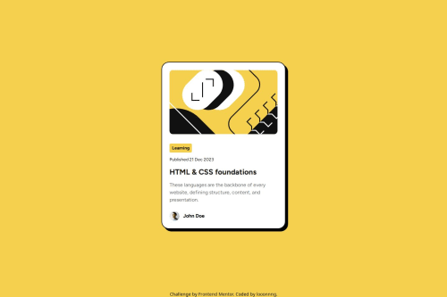
I think I followed the styles guide pretty close and got the hover effect right.
What challenges did you encounter, and how did you overcome them?I was struggling with the margin/padding of mobile layout. I wanted to write mobile first. However, the card component was giving me issues with overflowing image and that was a time sinker. Eventually, I just stuck with it and try to finish the rest of the code instead of tinkering prematurely.
What specific areas of your project would you like help with?Any feedbacks or refactoring are welcome!
Code
Loading...
Please log in to post a comment
Log in with GitHubCommunity feedback
No feedback yet. Be the first to give feedback on Long Mai's solution.
Join our Discord community
Join thousands of Frontend Mentor community members taking the challenges, sharing resources, helping each other, and chatting about all things front-end!
Join our Discord