@Diam0nazSubmitted 3 days ago
Latest solutions
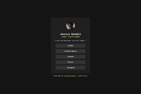
responsive card with flexbox
Submitted 18 days agoSpesific Areas
- I want to keep the card's layout still like on the dekstop screen by adjusting the card's width. Is there an effective solution to automatically adjusting the card's width.
Latest comments
- @cia2003Posted 3 days ago
Hello!
I see that you want to put a creativity in your project, like using different color for the background. It is great!
I suggest you read about BEM methodology to improve your code's clarity. It will be helpful for other developers to read your code. For example, I see in your html's code like this:
<div class="price">
  <span class="pic1"> $149.99 </span>
  <span class="pic2"> $169.99 </span>
</div>
As you can see in the div.price there are two spans with class
pic1andpic2. It is unclear if you said it as a price or picture.For the product category (div.DIV1), you can use properties like
text-transform' to uppercase the text orletter-spacing` to give space between the letters in CSS.Hope that helps!
0 - @mustafasen97Submitted about 1 month agoWhat are you most proud of, and what would you do differently next time?
I think I wrote the codes more regularly this time and I am quite happy with it. But I think I still have a lot to fix. Next time I'd like to make sure the codes are even more organized.
What challenges did you encounter, and how did you overcome them?I can say that I had a little difficulty with the instructions. I figured this part out by doing some research.
What specific areas of your project would you like help with?In general, every feedback is very important to me. I'm open to comments.
@cia2003Posted 8 days agoOke, I am impressed that you make the recipe page nearly pixel to the design one on desktop screen. You did great!
I have some advice for you about the code.
- At
.image-container, you set themin-heightandmax-heightto 300px. I suggest that you can add the propertyheightwith300pxvalue. And, I suggest you remove some properties likemin-width = 100%because you already declare it onwidthproperty .So, here is the code:
.img-container {
    height: 300px
    border-radius: 10px;
    width: 100%;
    box-sizing: border-box;
}
Marked as helpful1 - At
- P@kindlypi8MCeN7Submitted 15 days agoWhat are you most proud of, and what would you do differently next time?
Nothing.
What challenges did you encounter, and how did you overcome them?Nothing.
What specific areas of your project would you like help with?Nothing.
@cia2003Posted 15 days agoHello!
Based on the screenshots, I think you did good on the project. When I see your code, I see that you put
font-familyin (almost) every text element. I suggest that you can put thefont-familyat the body to make it the main font and add the font fallbacks as a backup font.As an example
body {
  /* other codes */
  font-family: "Inter", monospace;
}
The "monospace" family font is a font fallback.
Marked as helpful1 - @Axsel519Submitted 27 days ago@cia2003Posted 16 days ago
Overall, I think you did great! However, I think you need some improvements:
- You can add "gap" between each text so that it will look really nice. So, the code will look like this:
.text { display: flex; flex-direction: column; padding-left: 4vh; gap: 12px /* You can change the value*/ }- You can use
align-self: flex-startand addgap: 12pxto make the profile move to the left and remove the justify content and the right padding.
Hope that helps!
Marked as helpful0 - @Gab-offSubmitted about 1 month ago@cia2003Posted 18 days ago
Hello, Gabriel! This is my opinion about your code
- Yes, it does include semantic HTML, your code clearly states the main content and the footer.
- Yes, your code is accessible in different screen devices.
- Yes, the layout looks good on the different screen sizes.
- Yes, it is well-structured, readable, and reusable because you clearly state the semantic. Keep up the good work!
- Overall, your solution is not differed from the design, except for the size of the QR container.
0