Design comparison
SolutionDesign
Community feedback
- @cia2003Posted 20 days ago
Overall, I think you did great! However, I think you need some improvements:
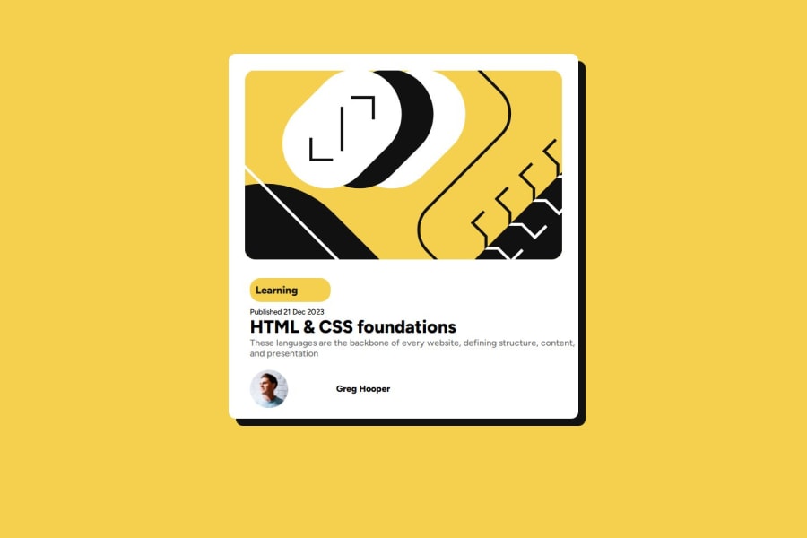
- You can add "gap" between each text so that it will look really nice. So, the code will look like this:
.text { display: flex; flex-direction: column; padding-left: 4vh; gap: 12px /* You can change the value*/ }- You can use
align-self: flex-startand addgap: 12pxto make the profile move to the left and remove the justify content and the right padding.
Hope that helps!
Marked as helpful0
Please log in to post a comment
Log in with GitHubJoin our Discord community
Join thousands of Frontend Mentor community members taking the challenges, sharing resources, helping each other, and chatting about all things front-end!
Join our Discord
