i struggled to find light brain icon and the light comment icon
chill31
@chill31All comments
- @dondelice257Submitted over 1 year ago@chill31Posted over 1 year ago
I think you forgot with the project, there are a few assets provided in the folder The font and icons are all there, with the colors also.
You need to check your project folder for style-guide.md and some other helpful files.
Marked as helpful0 - @MygaverseSubmitted over 1 year ago
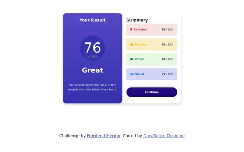
I achieved the solution by using bootstrap css grid and card. I also added a backdrop to simulate the preview design. The page is responisve for both desktop and mobile design. I had to do two "d-flex justify-content-center align-items-center" to get the result which I found its a little bit too much. Anyone can provide better solution will be appreciated!
@chill31Posted over 1 year agoGreat design! The colors and padding match perfectly with the challenge design.
I found only 1 issue with this, which is the background, it doesn't quite take up the full body, and there's a lot of whitespace between the light blue background and the white background of the body.
0 - @nattyriceSubmitted over 1 year ago
I used javascript to load the data.json. I am not sure if FEM will properly capture the fully loaded page in the screenshot.
This is a really rough first draft. I didn't hit any major roadblocks.
@chill31Posted over 1 year agoGreat work on loading the score from JSON, but looking at the project, there are a few style issues I found:
- The 2 columns' sizes are too big compared to the challenge design, and it causes issues in the responsiveness
- The circle in where it shows
76 of 100, the font weight and theof 100's colors don't match - The font weight of the individual scores are a little too much, and should be reduced to the ones given in the style-guide.md file.
- The
continuebutton does have a hover state, but the same state is not visible when focused, and only a default outline is shown, so consider adding a focus state also on the button. - the button's hover state has the wrong colors, as far as I remember, it was supposed to be a gradient, and your design only shows 1 color.
These issues are very minor and do not cause any problems in desktop or mobile, but the main issue to fix is:
- in mobiles, the design is not as good in desktop, and the columns are overflowing from the
xaxis. - the
@mediaqueries are not set up properly and in some tablet devices, the design is neither mobile's queries, nor desktop queries, so consider fixing this.
The font weights I mentioned above do not make any difference so it's not really a issue, but consider fixing the styles on mobile and some tablets.
Marked as helpful1 - @Pasang24Submitted over 1 year ago@chill31Posted over 1 year ago
Very nice design!
HTML
As you may have read above, the auto generated report shows that the images you used don't have a alternate text. To make the images more accessible, we add
altattributes and this is very important for all images.- You can fix your report's error by this:
<img src="./images/icon-reaction.svg" alt="reaction icon">And follow the same steps for all the other icons.
- Another way to do this same thing is just use the svg's in the HTML itself, rather than making images and using them as a source.
<svg ...>...</svg>these are the same svg's provided in the images/ folder in your design. Just an alternate, it does not make any difference.
CSS
- Another thing to notice is that you've (I think) ignored the active state of the button, which is supposed to be a gradient on hover (also focus because it's a button)
Leaving aside the accessibility, your design is very nice, and I really can't tell a difference between the design and your solution. Great work on the responsiveness too.
0 - @ITLUCDEVSubmitted over 1 year ago@chill31Posted over 1 year ago
The design you made is cool on it's own, but compared to the challenge, a few tweaks can be made:
- the paragraph's font size could be a little bit bigger
- the title's color should be according to the given color in style-guide.md
- there should be a little bit of gap between the 3 elements in the container.
I like the project overall
Marked as helpful0 - @Zahid-SarangSubmitted over 1 year ago@chill31Posted over 1 year ago
I am guessing it's not fully done? Because the individual stats are not visible (not done) in the webpage. All the other styles are cool
Marked as helpful0 - @LazyBoooySubmitted over 1 year ago@chill31Posted over 1 year ago
I dont know much about accessibility, so I'm going to ignore that.
The container is not centered vertically and the font weights do not match with the challenge design.
I think everything else is good. The fonts weight don't make that much difference but the vertical alignment makes a lot of difference and you might want to fix that.
1 - @fggdbdsbfdSubmitted over 1 year ago
GIVE ME FEEDBACK!!
@chill31Posted over 1 year agoMain problem is the font, it's not in use anywhere.
In the main container (the one with the white background and all the content like the images and paragraph), the border radius is (I think) too much if compared with the challenge, and the padding is less and doesn't look as good as the challenge design.
the image border radius has the same issue, it's too much.
The title's color does not match and the weight is too much. Maybe put 700 (as given in the style-guide.md file) and 400 for the paragraph (also given in style-guide.md)
There is also no visible box shadow in the container.
0


