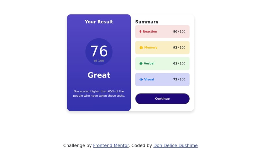
Design comparison
SolutionDesign
Solution retrospective
i struggled to find light brain icon and the light comment icon
Community feedback
- @0xabdulkhaliqPosted over 1 year ago
Hello there 👋. Congratulations on successfully completing the challenge! 🎉
- I have other recommendations regarding your code that I believe will be of great interest to you.
CSS 🎨:
- Looks like the component has not been centered properly. So let me explain, How you can easily center the component without using
marginorpadding.
- We don't need to use
marginandpaddingto center the component both horizontally & vertically. Because usingmarginorpaddingwill not dynamical centers our component at all states
- To properly center the component in the page, you should use
FlexboxorGridlayout. You can read more about centering in CSS here 📚.
- For this demonstration we use css
Gridto center the component.
body { min-height: 100vh; display: grid; place-items: center; }- Now remove this inline styles from
body, after removing you can able to see the changes
style="padding-top: 300px;"
- Now your component has been properly centered
.
I hope you find this helpful 😄 Above all, the solution you submitted is great !
Happy coding!
Marked as helpful0 - @chill31Posted over 1 year ago
I think you forgot with the project, there are a few assets provided in the folder The font and icons are all there, with the colors also.
You need to check your project folder for style-guide.md and some other helpful files.
Marked as helpful0@dondelice257Posted over 1 year ago@chill31 Thank you so much, let me check them out
0
Please log in to post a comment
Log in with GitHubJoin our Discord community
Join thousands of Frontend Mentor community members taking the challenges, sharing resources, helping each other, and chatting about all things front-end!
Join our Discord
