Caio de Alcantara Santos
@caio-alcantaraAll comments
- @caio-alcantaraSubmitted over 2 years ago@caio-alcantaraPosted over 2 years ago
So, is there a better way to follow the design as accurate as possible? I oftenly find myself having these kind of problems, mostly when it comes to paddings and margins.
0 - @caio-alcantaraSubmitted over 2 years ago@caio-alcantaraPosted over 2 years ago
I will correct these differences from the original design asap
0 - @ahmeDeid67Submitted over 2 years ago
Please give me notes ...
@caio-alcantaraPosted over 2 years agoHey, it looks great. To fix those accessibility issues you just need to wrap the body content into the tag <main>
1 - @grmbyrnSubmitted over 2 years ago
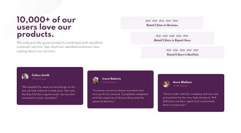
I had a little trouble making this look good on larger screens as there were a few moving parts to deal with, but I don't think it looks too bad in the end. Let me know if there's anything that I missed out on!
@caio-alcantaraPosted over 2 years agoHey, it looks amazing. I'd just say you need to fix the star icons position for big screens (they're on top of the text, but they should be by the side)
Marked as helpful0 - @liliaazzSubmitted over 2 years ago
what do you guys think, and please give me more suggestions of stuff that I need to improve thank you
@caio-alcantaraPosted over 2 years agoHey! You did a good job. To make your solution look more like the design, you could add some padding to the text part. Also, you can fix these accessibility issues by wraping all of the body content into the tag <main>. Good luck on your next challenges :)
Marked as helpful0 - @davevogelSubmitted over 2 years ago@caio-alcantaraPosted over 2 years ago
Great job! To fix these accessibility issues, you just need to wrap all of your body content into the tag <main>, and give an alt text to your images (alt texts are veeery important because they help screen readers and people with disabilities)
0 - @AlexanderWiklowSubmitted over 2 years ago
This page is not pixel-perfect. I am just happy i finished it:)
@caio-alcantaraPosted over 2 years agoHey, Alexander, great work! I'd say you just need to add some padding and adjust the font-size. And also, to fix these accessibility issues, you'll have to wrap all the body content into the tag <main>, and set an 'alt' text to every image. Cheers :)
Marked as helpful0 - @Codie123Submitted over 2 years ago@caio-alcantaraPosted over 2 years ago
Great job! To fix these accessibility issues, you need to wrap all the html body content into the tag <main>.
Marked as helpful0 - @caio-alcantaraSubmitted over 2 years ago@caio-alcantaraPosted over 2 years ago
I presume these star-icons not loading are a problem from Github Pages.
Edit: already fixed the stars position
0 - @elleneartelegSubmitted almost 3 years ago
I know that this isn't the best solution to this challenge, and there are many different things I could've done better/code cleaner, with that in mind, I would love to hear you feedback and insights!
@caio-alcantaraPosted almost 3 years agoI'd say you just need to add some padding-rigth to the "annual plan", and some padding-bottom to the 'cancel order' button
Marked as helpful0 - @caio-alcantaraSubmitted almost 3 years ago@caio-alcantaraPosted almost 3 years ago
How can I fix these accessibility issues?
0 - @LokheimSubmitted almost 3 years ago@caio-alcantaraPosted almost 3 years ago
Great work! I'd just be careful with those shadows
0


