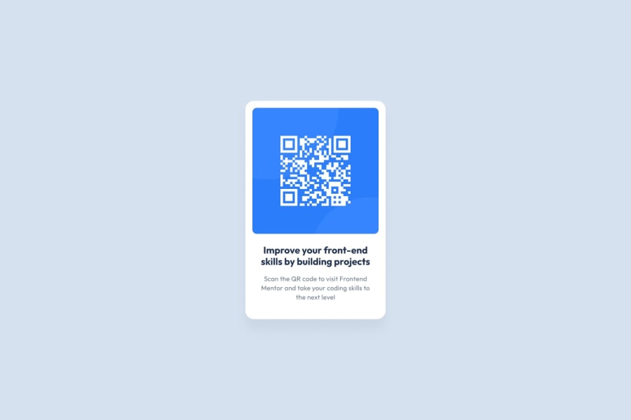
Design comparison
SolutionDesign
Solution retrospective
what do you guys think, and please give me more suggestions of stuff that I need to improve thank you
Community feedback
- @v-codeyPosted over 2 years ago
hey @liliaazz, nice effort you have put in the solution but there are a few things to note
- I saw your your first challenge of nft card component and @Danial Den has provided really good observations.
- you should try to incorporate those first , like adding
mainandfooterelements - dont use inline css (this is considered as not good practice)
- check style-guide and add font and colors accordingly.
hope you find it helpful, happy coding
Marked as helpful0 - @caio-alcantaraPosted over 2 years ago
Hey! You did a good job. To make your solution look more like the design, you could add some padding to the text part. Also, you can fix these accessibility issues by wraping all of the body content into the tag <main>. Good luck on your next challenges :)
Marked as helpful0
Please log in to post a comment
Log in with GitHubJoin our Discord community
Join thousands of Frontend Mentor community members taking the challenges, sharing resources, helping each other, and chatting about all things front-end!
Join our Discord
