Hi Jocelyne,
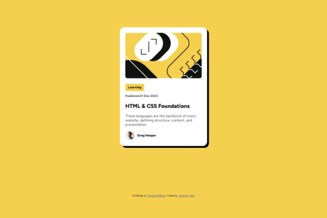
It seems you've got sizing and positioning right. You've just missed a CSS default reset. As you can see, even when you already set your max-width for the blog-card, it still doesn't grow to your desired width limit since the box-sizing property of the element is set to default, which is content-box.
The blog-card width on desktop is growing up to 456px because if you do the manual calculation in box-sizing: content-box it will add the margins + paddings + border + content size. It goes like this, Your margin is 12px on both sides, padding is 24px on both sides, and 384px for your content size, in total it would go up to 456px (12px + 24px + 384px + 24px + 12px = 456px).
To fix this and get an accurate sizing. You'll have to change the default of box-sizing property to border-box.
You could set it for all elements like this: (the * selector selects all elements, and change the default box-sizing for all elements)
CSS Snippet:
* { box-sizing: border-box; }
References:
P.S.
You've missed the border of the blog-card and you could also reset the margins default to 0, right now it seems that you have a margin on the body element that you didn't set. You could also use the * selector for this.
Hope this helps you. Happy Coding!