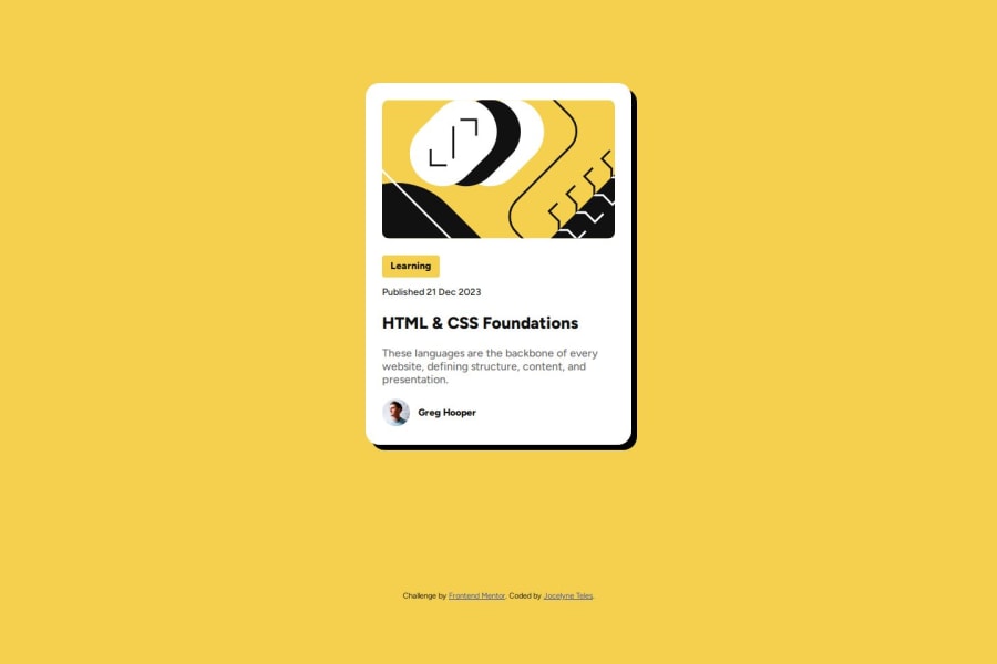
Not Found
Not Found
Not Found
Not Found
Not Found
Not Found
Not Found
Not Found
Not Found
Not Found
Not Found
Not Found
Not Found
Not Found
Not Found
Not Found
Not Found
Not Found
Not Found
Not Found

Submitted

My Blog Preview Card Solution

P

@JocelyneTeles98

Desktop design screenshot for the Blog preview card coding challenge

This is a solution for...

  • HTML
  • CSS
1newbie
View challenge

Design comparison


SolutionDesign

Solution retrospective


What are you most proud of, and what would you do differently next time?

This time I did almost everything by my own. I only had to research a little bit about hover state in CSS.

What challenges did you encounter, and how did you overcome them?

The most challenging part for me this time was the box-shadow. Since the free Figma version doesn't support dev mode anymore I had to "translate" the shadow aspect into code. But at the end it wasn't that difficult.

What specific areas of your project would you like help with?

I would like to receive suggestions about sizing and positioning for responsiveness. I think I managed it well but I would like to learn about the best practices or the easiest way to think about it when I have to code that part.

Community feedback

Brian 150

@briangesteban

Posted

Hi Jocelyne,

It seems you've got sizing and positioning right. You've just missed a CSS default reset. As you can see, even when you already set your max-width for the blog-card, it still doesn't grow to your desired width limit since the box-sizing property of the element is set to default, which is content-box.

The blog-card width on desktop is growing up to 456px because if you do the manual calculation in box-sizing: content-box it will add the margins + paddings + border + content size. It goes like this, Your margin is 12px on both sides, padding is 24px on both sides, and 384px for your content size, in total it would go up to 456px (12px + 24px + 384px + 24px + 12px = 456px).

To fix this and get an accurate sizing. You'll have to change the default of box-sizing property to border-box.

You could set it for all elements like this: (the * selector selects all elements, and change the default box-sizing for all elements)

CSS Snippet: * { box-sizing: border-box; }

References:

P.S. You've missed the border of the blog-card and you could also reset the margins default to 0, right now it seems that you have a margin on the body element that you didn't set. You could also use the * selector for this.

Hope this helps you. Happy Coding!

Marked as helpful

1

P

@JocelyneTeles98

Posted

@briangesteban Hi, Brian!

I tested your suggestion and now it looks more like the design! I didn't know about the CSS Box Model property, I found it very useful. Thank you for sharing with me your suggestion, and for paying attention to my doubt!

Happy Coding for you too! 😊

0
Brian 150

@briangesteban

Posted

@JocelyneTeles98 No worries. Glad that helped you. Cheers! 😊

1
P
Steven Stroud 9,380

@Stroudy

Posted

Exceptional work! You’re showing great skill here. I’ve got a couple of minor suggestions that could make this stand out even more…

  • You have wrapped loads of HTML elements in <div> that dont need to be, The element inside already has semantic meaning and it is on its own, Making the div irrelevant,
        <div class="content-label">
          <p>Learning</p>
        </div>❌
        <div class="content-date">
          <p>Published 21 Dec 2023</p>
        </div>❌
  • Using a full modern CSS reset is beneficial because it removes default browser styling, creating a consistent starting point for your design across all browsers. It helps avoid unexpected layout issues and makes your styles more predictable, ensuring a uniform appearance on different devices and platforms, check out this site for a Full modern reset

  • I think you can benefit from using a naming convention like BEM (Block, Element, Modifier) is beneficial because it makes your CSS more organized, readable, and easier to maintain. BEM helps you clearly understand the purpose of each class, avoid naming conflicts, and create reusable components, leading to a more scalable codebase. For more details BEM,

  • While px is useful for precise, fixed sizing, such as border-width, border-radius, inline-padding, and <img> sizes, it has limitations. Pixels don't scale well with user settings or adapt to different devices, which can negatively impact accessibility and responsiveness. For example, using px for font sizes can make text harder to read on some screens, Check this article why font-size must NEVER be in pixels. In contrast, relative units like rem and adjust based on the user’s preferences and device settings, making your design more flexible and accessible. Use px where exact sizing is needed, but prefer relative units for scalable layouts. If you want a deeper explanation watch this video by Kevin Powell CSS em and rem explained. Another great resource I found useful is this px to rem converter based on the default font-size of 16 pixel.

  • Line height is usually unitless to scale proportionally with the font size, keeping text readable across different devices. Best practice is to use a unitless value like 1.5 for flexibility. Avoid using fixed units like px or %, as they don't adapt well to changes in font size or layout.

I hope you’re finding this guidance useful! Keep refining your skills and tackling new challenges with confidence. You’re making great progress—stay motivated and keep coding with enthusiasm! 💻

Marked as helpful

0

P

@JocelyneTeles98

Posted

@Stroudy thank you very much for the observation and the links to provide more information. I really appreciate these advices to write effective and clean code. I will read them and apply them for future code, and also make the necessary fixes for this one.

Thank you very much, again! Happy coding! 😊

1
P
Steven Stroud 9,380

@Stroudy

Posted

Hey @JocelyneTeles98, No problem, You got this! 💪

1

Please log in to post a comment

Log in with GitHub
Discord logo

Join our Discord community

Join thousands of Frontend Mentor community members taking the challenges, sharing resources, helping each other, and chatting about all things front-end!

Join our Discord