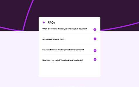
I did it, but i would like if someone help me, because if i open more than 1 option the text overextend the card itself, and i think that if i could create a function that make just one option avaiable to open at time, but i dont know how to do it, can someone helps me with it?
beniusis
@beniusisAll comments
- @VidottizzzSubmitted 10 months ago@beniusisPosted 10 months ago
Hey 👋 Congratulations on completing the challenge!
The text overflows because you have set the card's height as 34rem. To fix that, you can set
height: fit-content.1 - @itsU-KSubmitted 10 months ago@beniusisPosted 10 months ago
Hey 👋 Good job on completing the challenge!
A few things worth mentioning:
- You should use only one
<h1>tag per page. You can read more about the accessible heading structure here. - You should not leave empty
altattributes for images. It is read by screen readers for people with visual impairments and is better for SEO. You can read more about it here. - You could use semantic elements like
<main>,<footer>,<header>to improve accessibility and achieve better organization. For example, switch<div class="containt">to<main class="containt">.
I hope the feedback was helpful. Happy coding! 😀
Marked as helpful0 - You should use only one
- @J3r3miaSubmitted 10 months ago
Struggling with centering my component when its in desktop view.
@beniusisPosted 10 months agoHey 👋 Good job on finishing the challenge! To answer your question, you can switch body property
height: 100%tomin-height: 100vhto center the component.Marked as helpful0 - @ChaosBlitz404Submitted 10 months ago
okay i dont know some stuff
- how do i make the $169.99 center with the big $149.99 text
- how do i make the web responsive like two different version for mob and desktop?
thats all.all feedbacks are welcome thanks!
@beniusisPosted 10 months agoHey 👋 Good job on finishing the challenge! I know there are stuff to be corrected, so here's a few things worth mentioning:
- You can set
letter-spacingproperty in CSS instead of using non-breaking space entities here:<p class="perfume"> P e r f u m e</p>. <strike>tag is not supported anymore in HTML5. Instead use<del>tag for the previous price of the product.- You should not use
<br>tags just for the sake of leaving gaps between the different elements. Read more about its purpose here. - You should use semantic elements like
<main>,<header>,<footer>to improve accessibility and achieve better organization. - To vertically align current price and old price elements, you could wrap them both in one
<div>and use flexbox propertyalign-items: center. You can read more about the usage of flexbox here. While reviewing your code, I noticed that you overuseposition: absoluteproperty. Personally, I would rather learn flexbox and implement its usage for better experience. - To create a responsive web page, you can use media queries and set different properties to different elements. Here's an article with basics of responsive web design.
Happy coding! 😀
Marked as helpful4 - @Jonndev25Submitted 10 months ago
I learned little about responsive design.
Any feedback will help me to improve. Thanks
@beniusisPosted 10 months agoHey 👋 Good job on completing the challenge! A few things that caught my eye:
- Why is there two
min-heightproperties for body? I think you forgot to delete one. - After
1440px(at1441pxand up) the layout is shown as for mobile one.
Marked as helpful0 - Why is there two
- @manjubhaskar02Submitted 11 months ago
This is my solution for Age-Calculator-App.
Welcoming every suggestion for improving this solution.
@beniusisPosted 11 months agoHey. Great job on completing the challenge! I did not look through the technicalities but judging from the site preview, calculation of the age is wrong. For example, if you put the date as January 5th of 2024, the result you get is as follows: -1 years -4 months -22 days. The inputs for day and month are switched.
Marked as helpful1


