Liam
@asmthliAll solutions
- Submitted about 2 months ago
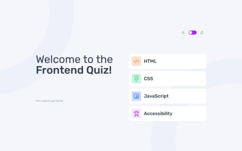
Frontend Quiz with React
- HTML
- CSS
- JS
One thing I was wondering though was for things such as the purple button. Is it worth making this a component simply to hold some related styling? The component has no state or special functionality and simply returns a HTML button. It is repeated with the same styling throughout the application however. How would you go about styling this (especially with CSS modules in mind). Would it be best to make a global (non module) button class for styling? My thought was to create a component and have an attached CSS module for the styling.
Thanks
- Submitted 2 months ago
Time Tracking Dashboard with React
- HTML
- CSS
- JS
I decided against wrapping the buttons in the ID card section and giving them their own state (for highlighting them when selected). Instead, I have updated their class when the header is re-rendered. In this case there doesn't seem to be much of a difference to me. I'd appreciate any feedback on this though.
Cheers
- Submitted 2 months ago
Interactive Card Component with React
- HTML
- CSS
- JS
Up until now, I have always used a link element in my page head to include fonts. The problem is, I want my React components to be encapsulate all of their related dependencies so they are properly modular. Reading around online, people seem to warn against using a CSS @import as it is slower than a element. I have gone ahead and used the @import because it keeps my font dependency for the component together with the component itself. Is this the recommended way with React? Does the bundler do some magic with the CSS @import when using React? I'd greatly appreciate if anyone could explain this a bit better or generally give me some advice.
Cheers
- Submitted 3 months ago
Responsive Landing Page
- HTML
- CSS
I saw somewhere that it is possible to include an inline SVG by referencing it from another place in your markup - say, at the bottom. We then have the advantages of inline SVG without the bulk in the middle of the markup. I'd be grateful if anyone could give me some tips on best practice about doing this sort of thing?
Thanks!
- Submitted 4 months ago
Responsive Card Layout using Grid
- HTML
- CSS
My problem relates to point number 3 above. It seems it would be nice to give an element a grid area with the intention of using it only later in a media query. This however seems to have stopped the automatic assignment to rows happening. I tried also assigning grid-auto-rows: auto and this fixed it but then broke my desktop layout when I wanted to use the grid areas in a media query.
My question is: am I right in thinking that once a grid-area is assigned, the layout must be done using the grids areas? Or was something else causing this? My solution was to assign the grid areas only in the media query, but if you look at my CSS, it seems better to put the area names in the styles before the media query.
Thanks
- Submitted 4 months ago
Card Feature Page - Made Responsive Using Grid
- HTML
- CSS
My solution always has a vertical scroll-bar. I would appreciate it if someone could give me an overview of roughly how they would go about eliminating this where possible.
- Submitted 4 months ago
Product Preview Card with Responsive Layout
- HTML
- CSS
I am still unsure of the best way to make text size dynamic. I have thought about using clamp along with view height units for the font size. Would it be best to set the root element font size in this way and then use rem units everywhere?
Thanks


