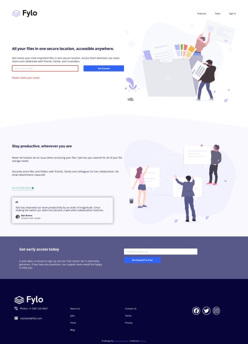
Responsive Landing Page

Solution retrospective
I wrestled with using SVGs before remembering about using font icons. I am proud of how the social media icons turned out, whilst learning a bit more about SVGs and their merits/downsides in the process.
What challenges did you encounter, and how did you overcome them?One thing that tripped me up was perhaps trying to go too far with the separation of styling and content. For me, it made sense for the navigation links in the footer to be one list - there was nothing semantically differentiating the two columns. My first approach was then to have them all in one list. Creating the small gap between the two separate lists for the mobile version was easily done using bottom-margin. Splitting the lists for the desktop version seemed to be more trouble than it was worth. I thought of individually targeting members of the list and giving them a grid column. In the end, I decided it was much easier to simply split the list into two in the markup.
A similar problem came about when trying to place the background curve using pseudo-elements. Again - trying perhaps a little too much to separate style and content. I could only place the curve as a pseudo-element of the second large section - in this case it was of course within the section's content box which had padding around it. To get it to span the entire width of the screen, the methods I was thinking of all seemed quite hacky. I ended up including it as an image in the content which allowed it to fit in nicely with the flow of the document (which hacks including position: absolute would have broken), and setting aria-hidden would hide it from screen-readers.
One last thing relates to SVGs. I found that using a font icon allowed me to do simple colouring of the entire icon. I was originally looking at doing this with SVGs but it seems overkill for this simple use case. Using an inline SVG creates a large bloat in the markup making it less readable in my opinion.
What specific areas of your project would you like help with?I saw somewhere that it is possible to include an inline SVG by referencing it from another place in your markup - say, at the bottom. We then have the advantages of inline SVG without the bulk in the middle of the markup. I'd be grateful if anyone could give me some tips on best practice about doing this sort of thing?
Thanks!
Please log in to post a comment
Log in with GitHubCommunity feedback
No feedback yet. Be the first to give feedback on Andrew's solution.
Join our Discord community
Join thousands of Frontend Mentor community members taking the challenges, sharing resources, helping each other, and chatting about all things front-end!
Join our Discord