Not Found
Not Found
Not Found
Not Found
Not Found
Not Found
Not Found
Not Found
Not Found
Not Found
Not Found
Not Found
Not Found
Not Found
Not Found
Not Found
Not Found
Not Found
Not Found
Not Found

All comments

  • @AidanvG

    Submitted

    I struggled to get the blue background colour the same as in the screenshots provided. Is there a way to get the RGB/Hex values from a specific part of an image, or is that not possible?

    I'm not super familiar with semantics for html, so please could you suggest what elements I could have used instead of divs.

    I would also like to know, generally speaking, when it is more appropriate to use % values (or other relative values) instead of px values when working with sizing, margin, padding, etc.

    I would also appreciate any other general feedback :)

    Aravindhan 320

    @aravindhan7

    Posted

    1. Use any color picker app or extension, so that you can know the exact color from anything on your screen.

    2.Kindly go thorugh the source regarding semantic tags

    3.And regarding (px,em,rems) Use px for small, fixed-size elements like borders or shadows. Use em for typography and other scalable elements that need to change size relative to their parent element. Use rem for scalable typography and responsive layouts that need to change size relative to the root element.

    And BTW your solution is super good!

    Marked as helpful

    1
  • Jaynarol 150

    @Jaynarol

    Submitted

    While Tailwind doesn't appear to support HSL colors, I've had to resort to using online conversion tools to change them to HEX. This adds a bit more effort to my workflow. Is it common in the tech industry to use HSL as the standard for styling guides?

    and If anyone would like to suggest improvements or comment on any part of my code, I would greatly appreciate it.

    Aravindhan 320

    @aravindhan7

    Posted

    As per Tailwind concerns,

    Tailwind CSS provides utility classes that allow you to apply HSL colors to your elements easily.

    Here's an example of how you can use HSL colors with Tailwind CSS:

    <div class="bg-hsl-150 text-hsl-210">
      This is a div with a background color of HSL(150, 100%, 50%) and text color of HSL(210, 100%, 50%).
    </div>
    

    In this example, the bg-hsl-150 class sets the background color to HSL(150, 100%, 50%), and the text-hsl-210 class sets the text color to HSL(210, 100%, 50%).

    Tailwind CSS provides a range of utility classes for different HSL colors, allowing you to adjust the hue, saturation, and lightness components easily. You can customize the colors and configure the HSL values according to your design needs in your Tailwind CSS configuration file.

    By the way your solution is super solid, and the tailwind usage is pretty neat.

    Marked as helpful

    0
  • @Ashok-Kumar-dharanikota

    Submitted

    Challenges Faced: During the construction of the project, I encountered challenges, particularly while attempting to achieve a responsive design. The main issue I faced was the adaptation of the image or banner for mobile views. I couldn't discern the best approach to replace or adjust the banner image when accessed via a mobile device.

    Areas of Uncertainty: My primary area of uncertainty lies within the principles of responsive design. I'm eager to gain a deeper understanding of these principles and practices.

    Request for Assistance: Any suggestions or recommendations for resources pertaining to responsive design would be greatly appreciated. I'm eager to enhance my knowledge in this domain.

    Aravindhan 320

    @aravindhan7

    Posted

    Hey the solution is pretty good, its now time for you to take on to add mobile responsive codes in your upcoming challenges, kindly dont skip the responsive part,..learn about media queries. (https://developer.mozilla.org/en-US/docs/Learn/CSS/CSS_layout/Media_queries)

    The first way to use media queries is to have the alternate section of CSS right inside your single stylesheet. So to target small devices we can use the following syntax:

    @media only screen and (max-device-width: 480px) { }

    We can then add our alternate CSS for small screen and width devices inside the curly braces. By using the cascade we can simply overwrite any styles rules we set for desktop browsers earlier in our CSS. As long as this section comes last in your CSS it will overwrite the previous rules.

    Hope this helps!..

    Marked as helpful

    1
  • @rohmatsetiawanmta

    Submitted

    In this challenge, I utilized only HTML and CSS. Please let me know how I can enhance this code. Kindly consider the following key points:

    • Is it accessible?
    • Is it responsive?
    • Is the code organized and easy to read?
    • Does the layout appear appealing?
    Aravindhan 320

    @aravindhan7

    Posted

    1. Actually you should use semantic tags to make it more accessible

    Examples of non-semantic elements: <div> and <span> - Tells nothing about its content. Examples of semantic elements: <form>, <table>, and <article> - Clearly defines its content.

    2.Yes the solution is pretty responsive

    3.code is organised well and easy to read. kindly go thru the BEM resource https://css-tricks.com/bem-101/

    4.The layout is good and the solution is awesome.Kudos

    Marked as helpful

    1
  • Ventthos 10

    @Ventthos

    Submitted

    I had problems making the circle, since I don't know how to make a perfect circle while it has some elements inside. In the end, I decided to assing a fixed value, but I guess that's not correct for a responsive design. Do you have some recommendations?

    Aravindhan 320

    @aravindhan7

    Posted

    Hey that was a good solution,

    To create a circle, use the border-radius property and set the value to 50%. Then combine the height and width properties with a matching value, as simple as that.

    Hope it is helpful.

    0
  • Aravindhan 320

    @aravindhan7

    Posted

    Hey thats a great solution for being a beginner,

    i have few points to share, First the font family is different, kindly cross check with the style guide.

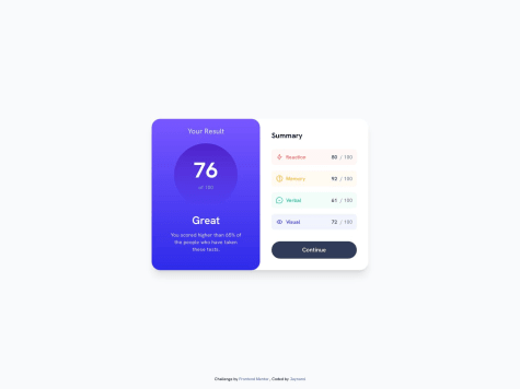
    And next thing is the 4 colors below the summary area , you could have added opacity to look like the original design.

    And lastly , practice the CSS file to be separate, like index.css and import in html. Its the best way to practice.

    Hope this is useful.

    Marked as helpful

    2
  • OsolalDev 70

    @OdaSolaDev

    Submitted

    Hey there! ^-^ I'm starting to do my own stuff since I started learning Web Development, and I would appreciate some feedback, especially about how I write my code (if it can be optimized or other ways of doing the same thing).

    Aravindhan 320

    @aravindhan7

    Posted

    Hey, your solution was soo good, small corrections i want to tell.

    when the button is clicked, it should remain orange, but your solution shows grey when numbers are clicked.

    Morover if you hover numbers and submit button, the transition is soo fast. you can add timing to transition like

    transition: 0.3s (to look the hovers smooth)

    hope it is useful

    Marked as helpful

    0
  • P

    @Stephanie-Dennehy

    Submitted

    Hi! This is the first challenge I have completed. I'd love some feedback regarding my HTML structure. I want to make sure that I'm using best practices as I create new files.

    I also had a hard time getting the "view icon" to show up correctly on the image hover. If anyone can tell me what I did wrong here, I'd appreciate it! I tried multiple solutions and couldn't manage to get that part right.

    Aravindhan 320

    @aravindhan7

    Posted

    For an idea of best practise for HTML, kindly go thru below blog https://www.freecodecamp.org/news/html-best-practices/

    and the eye icon simply you play with the opacity

    first create the eye icon with blue background and set over the image and give opactity 0

    while hover, you change the opacity to 1.

    Hope this is useful for you!.

    Marked as helpful

    0
  • @RahulRSoni

    Submitted

    When I wrote the code for the QR code component, I stuck only one place when I centered all the components in the middle of the page.

    I am unsure about the responsiveness. I wrote the code too, but I am not sure if it is right or not.

    what is a good approach to writing the code?

    Aravindhan 320

    @aravindhan7

    Posted

    to centere at the middle of the page

    use the below css

    body{ min-height:100vh; display:flex; align-items:centre; justify-content:centre; }

    hope this is useful for you..

    Marked as helpful

    0
  • @ignaciorumbodesk

    Submitted

    hi! this is my second challenge. I think the css code can be much better.

    well.. i have been many problems with the position of the blue box. his position over the white box.

    and handling the list element and his elements inside, positioning them on the right place.

    what do you think?

    i apresiate your feedback!

    Aravindhan 320

    @aravindhan7

    Posted

    you finding difficulties in positioning blue and white box.

    let me explain simple,

    create a main div, inside main div, you just wrap the blue box div and white box div.

    So now inside the main div , you will have blue box div and white box div.

    no apply flex in main div, and flex direction to row, so now the blue and white box will be aligned in a row as per the requirement. breakdow the challenge and create a hand drawn layouts and convert into the divs and it will simple for you to proceed.

    Marked as helpful

    1
  • @stevenarmandoo

    Submitted

    this is my 2nd solution, I add the alt attribute to img tag. using <main> tag. Open for feedback

    Aravindhan 320

    @aravindhan7

    Posted

    hey, one thing i have noticed is that, the font-family you used in CSS .text h2{ .... font-family: Outfit; .... } This doesnt work.

    You missed to import the font , and after importing font, (https://www.w3docs.com/snippets/css/how-to-import-google-fonts-in-css-file.html) you should specify

    font-family:"outfit", sans-serif;

    the imported font should come inside double colon and a second font after comma is called fallback font.

    A fallback font is a font face that is used when the primary font face is not loaded yet, or is missing glyphs necessary to render page content.

    hope you understand!

    Marked as helpful

    0