

@AperlaeSubmitted over 3 years ago
Latest solutions
Latest comments
- @alexatttPosted over 3 years ago
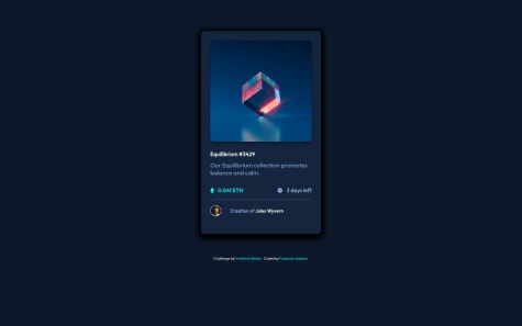
Nice job! 😊 To make it look better on smaller screens (phone), you can add .card margin, for instance, margin: 0px 20px; That way, it won't take up the whole phone screen width.
Good luck with other challenges!
Marked as helpful0 - @jordankimseySubmitted over 3 years ago@alexatttPosted over 3 years ago
To remove success message, you can use setTimeout, in your case it could look something like this setTimeout(function(){ text.innerHTML = ' '; }, 3500); This will remove Success message after 3.5 seconds ;)
Marked as helpful0 - @jordan-naSubmitted over 3 years ago
- @PriyanshuSaxena2612Submitted over 3 years ago@alexatttPosted over 3 years ago
Overall nice job!! Seems responsive, hover animations are nice. :)
One thing though - card shadow seems a little bit thick, box-shadow parameters 0 1.4rem 3.5rem 0.1rem #00000085 for .outer-card seemed to look good to my eye, maybe you can try something you think would look better. :)
0 - @Niko0918Submitted over 3 years ago@alexatttPosted over 3 years ago
Great job!!!
One thing - you might want to add some left and right margin for the card/change card width a little bit so it is not 100%, for mobile screens. I opened it from my phone, and although it doesn’t look bad, it would look slightly better if there was some left and right space :)
Marked as helpful0 - @GioltekSubmitted over 3 years ago@alexatttPosted over 3 years ago
I am not sure whether you have tried this...but :) You can simulate responsiveness of your web app and change dimensions of the possible screen, by right-clicking in your page, then "Inspect" and in the Devtools tab, which opens, on the top left you will see small phone/tablet icon, if you hover over it says Toggle device toolbar. Click it, then on your page, on top you will see a toolbar, choose dimensions: Responsive and then you can change your dimensions both manually and also below this toolbar you can click on different pre-defined dimensions, for example, Tablet - 768px, Laptop - 1024px, Laptop - 1440px etc. Despite the difficulties you faced, your solution looks nice anyway!
Marked as helpful1