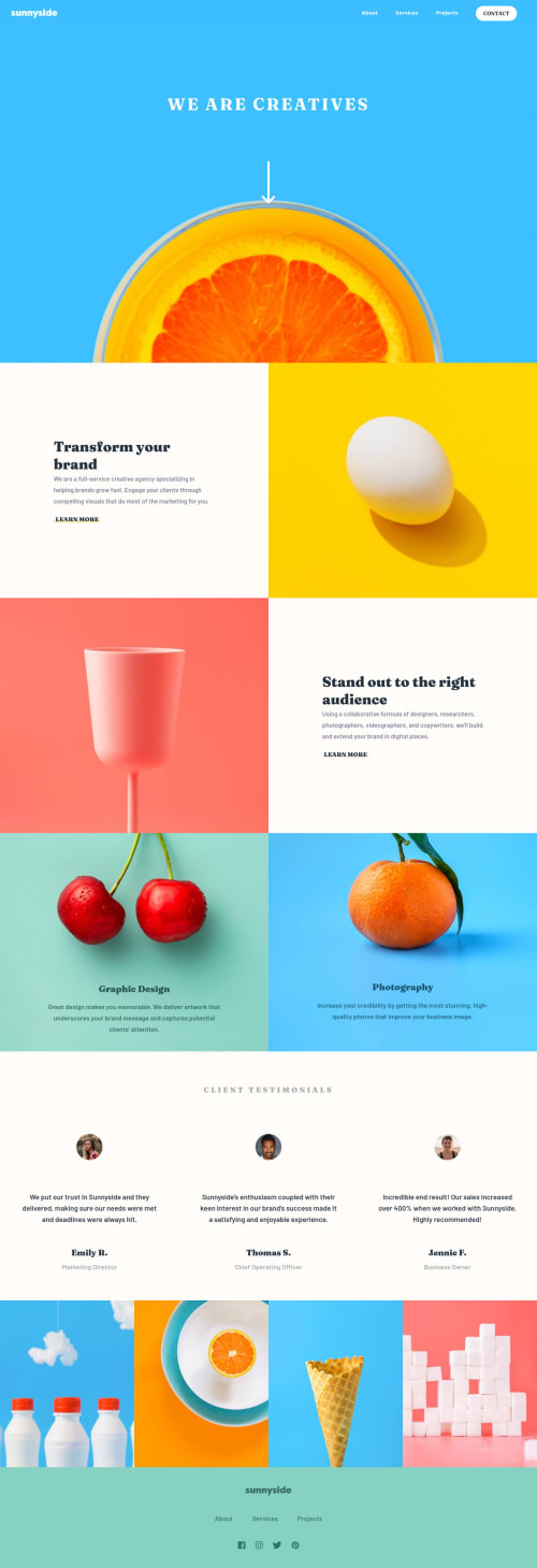
Design comparison
Solution retrospective
My last Frontendmentor challenge for this year. π π It was quite enjoyable to create this page, perhaps because it was so colorful and joyful.
Community feedback
- @anoshaahmedPosted almost 3 years ago
To avoid accessibility issues in the future, start your headings with
<h1>
and move up by one level each timeGood job! :)
Marked as helpful1@alexatttPosted almost 3 years ago@anoshaahmed thanks! I will try and solve this issue! :)
1 - @mamba-dev-KEPosted almost 3 years ago
test it on large displays such as monitors and you will notice that the site continues to stretch. consider using a max-width to set a fixed width so that it displays correctly in large devices.
1@alexatttPosted almost 3 years ago@mamba-dev-KE hmm alright I will check that, although I tested it on my screen which is above 1440px and everything seemed fine. Will check once again.
0@mamba-dev-KEPosted almost 3 years ago@alexattt hey there. Let me attach a screenshot for you
img -> https://i.imgur.com/Dfzd3WA.jpg
Marked as helpful0@alexatttPosted almost 3 years ago@mamba-dev-KE oh yes I understand now, I will probably change max width and make it smaller, so the layout stays the way it should be in design. Thanks π
0 - @DavidEmad01Posted almost 3 years ago
Very Nice page
Let's start a new Journey in 2022 3>
1@alexatttPosted almost 3 years ago@DavidEmad01 Thank you! π Yeah! May it be good and full of new knowledge one.
1
Please log in to post a comment
Log in with GitHubJoin our Discord community
Join thousands of Frontend Mentor community members taking the challenges, sharing resources, helping each other, and chatting about all things front-end!
Join our Discord