@PrajulJaggi577Submitted about 2 months ago

P
abm-afk
@abm-afkAll comments
- @abm-afkPosted about 2 months ago
👍 What’s Great:
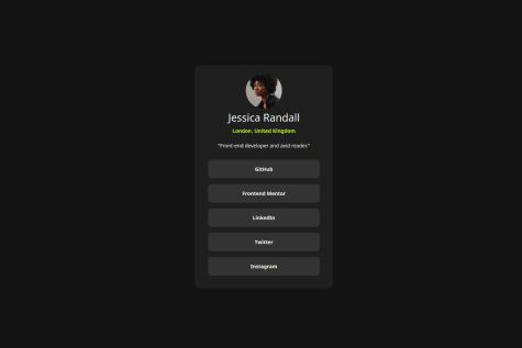
Clean Structure: Your HTML is organized with clear sections for the avatar, title, description, and links. Flexbox Usage: You’re using Flexbox to center elements, which is a solid approach for alignment. CSS Variables: Good use of CSS variables for consistent color management.
🔧 Areas to Improve:
1.CSS Variable Naming: • Use lowercase and hyphens: It’s a common convention for readability. • Example:
:root {
    --green: hsl(75, 94%, 57%);
    --white: hsl(0, 0%, 100%);
    --grey-700: hsl(0, 0%, 20%);
    --grey-800: hsl(0, 0%, 12%);
    --grey-900: hsl(0, 0%, 8%);
}
2.CSS Syntax: • Avoid Nested Selectors: The &:hover syntax is for preprocessors like SCSS, not plain CSS. • Fix Hover Styles:
.link:hover {
    background-color: var(--green);
    color: var(--grey-700);
}
Marked as helpful1 - @LylaisSubmitted about 2 months ago@abm-afkPosted about 2 months ago
Hey! Great work on this project! You’ve got a solid structure, and it’s clear you put a lot of thought into the layout and design. Everything looks neat, and I like how you’re using semantic tags like <section> and <h2>. Just a few suggestions to make it even better:
HTML Feedback:
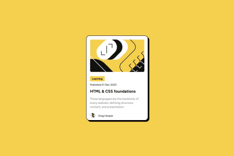
- Image Paths: It’s a small thing, but be careful with your image paths. Instead of using blog-preview-card-main(1)/..., try something simpler like ./assets/.... This will make your project more portable and easier to manage if you move it around.
- Element Naming: You’ve got .auteur-information—which is fine—but to keep things simple and consistent, maybe rename it to .author-info? It’ll match up better with other classes like .author-pic and .author-name.
- Alt Text: You’ve added alt attributes to your images, which is awesome! For the author avatar, you could describe it a bit more—something like alt="Greg Hooper's avatar" would make it more accessible.
CSS Feedback:
4.	Author Section Alignment:
The author picture and name aren’t lining up perfectly. You could use flexbox to fix that and get them centered. Something like this should do the trick:
.auteur-information { display: flex; align-items: center; margin: -16px 0 16px 22px; }
5.	Font Sizes and Spacing:
Consider switching to rem or em for font sizes and spacing instead of px. This will make your design more flexible, especially on different screen sizes or for accessibility settings.
.text p { font-size: 1.125rem; line-height: 1.5; }
6.	Consistent Spacing:
Try sticking to a consistent spacing system (like 4px, 8px, 16px, etc.) for margins and paddings. It’ll help make the design feel more balanced.
Marked as helpful0 - @DanniJK1Submitted about 2 months agoWhat are you most proud of, and what would you do differently next time?
I am most proud of how close my final solution looked in comparison to the initial challenge design.
What challenges did you encounter, and how did you overcome them?I encountered the challenge of not knowing how to properly use CSS in some cases to make the elements look or behave a certain way. I overcame this by using websites like w3schools.com to look up some aspects of CSS.
@abm-afkPosted about 2 months agoLooks good! Tips to improve:
- Try to focus more on semantic tags, read about them and understand how to use them properly
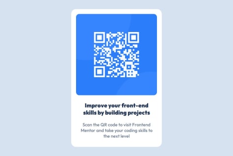
- Proper naming for classes/ids to describe what is the component you are working on, like "card-container, card__qr-code, card__description". With such approach it would be much easier to understand which part of component you are working on the bigger project.
- You used ids to style components, which bring incosistency. While styling your components use classes. I would suggest to use ids for some specific cases when you want to style exact component, not a group of, and also for javascript manipulation.
0