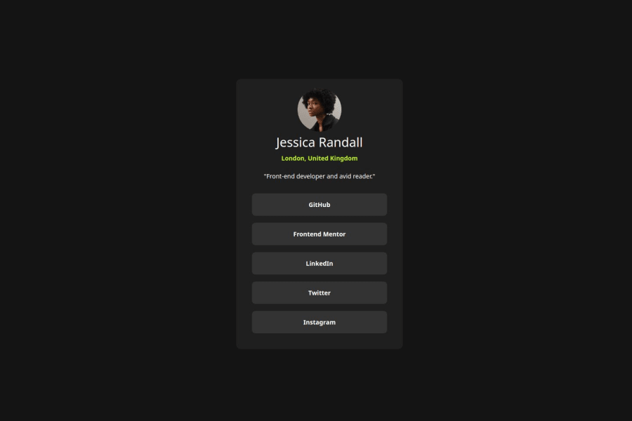
Design comparison
SolutionDesign
Community feedback
- @abm-afkPosted about 2 months ago
👍 What’s Great:
Clean Structure: Your HTML is organized with clear sections for the avatar, title, description, and links. Flexbox Usage: You’re using Flexbox to center elements, which is a solid approach for alignment. CSS Variables: Good use of CSS variables for consistent color management.
🔧 Areas to Improve:
1.CSS Variable Naming: • Use lowercase and hyphens: It’s a common convention for readability. • Example:
:root {
    --green: hsl(75, 94%, 57%);
    --white: hsl(0, 0%, 100%);
    --grey-700: hsl(0, 0%, 20%);
    --grey-800: hsl(0, 0%, 12%);
    --grey-900: hsl(0, 0%, 8%);
}
2.CSS Syntax: • Avoid Nested Selectors: The &:hover syntax is for preprocessors like SCSS, not plain CSS. • Fix Hover Styles:
.link:hover {
    background-color: var(--green);
    color: var(--grey-700);
}
Marked as helpful1
Please log in to post a comment
Log in with GitHubJoin our Discord community
Join thousands of Frontend Mentor community members taking the challenges, sharing resources, helping each other, and chatting about all things front-end!
Join our Discord
