

Design comparison
SolutionDesign

Community feedback
- @abm-afkPosted about 2 months ago
Hey! Great work on this project! You’ve got a solid structure, and it’s clear you put a lot of thought into the layout and design. Everything looks neat, and I like how you’re using semantic tags like <section> and <h2>. Just a few suggestions to make it even better:
HTML Feedback:
- Image Paths: It’s a small thing, but be careful with your image paths. Instead of using blog-preview-card-main(1)/..., try something simpler like ./assets/.... This will make your project more portable and easier to manage if you move it around.
- Element Naming: You’ve got .auteur-information—which is fine—but to keep things simple and consistent, maybe rename it to .author-info? It’ll match up better with other classes like .author-pic and .author-name.
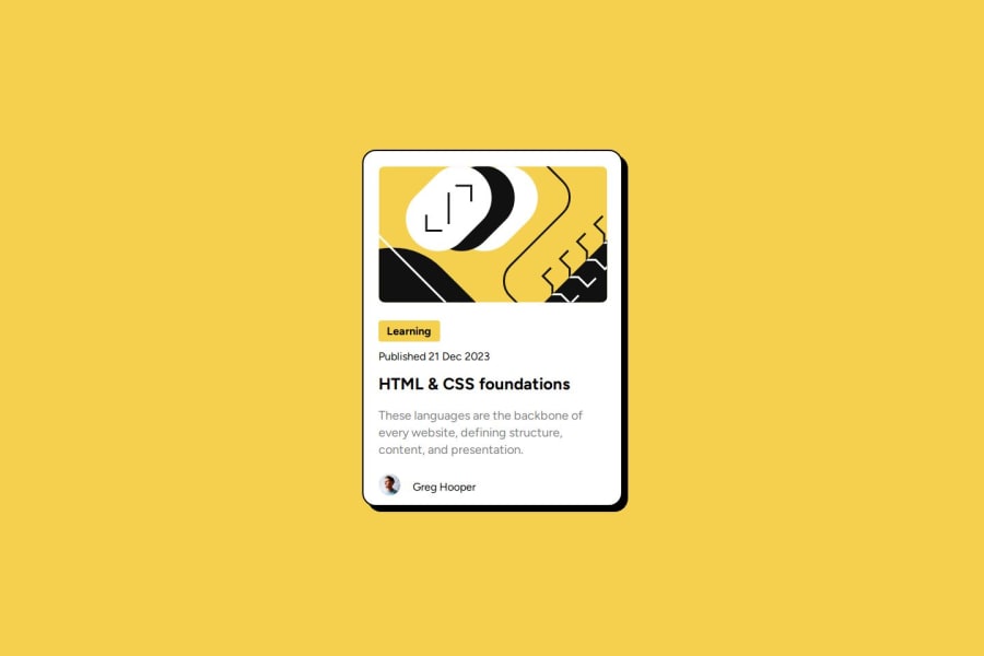
- Alt Text: You’ve added alt attributes to your images, which is awesome! For the author avatar, you could describe it a bit more—something like alt="Greg Hooper's avatar" would make it more accessible.
CSS Feedback:
4.	Author Section Alignment:
The author picture and name aren’t lining up perfectly. You could use flexbox to fix that and get them centered. Something like this should do the trick:
.auteur-information { display: flex; align-items: center; margin: -16px 0 16px 22px; }
5.	Font Sizes and Spacing:
Consider switching to rem or em for font sizes and spacing instead of px. This will make your design more flexible, especially on different screen sizes or for accessibility settings.
.text p { font-size: 1.125rem; line-height: 1.5; }
6.	Consistent Spacing:
Try sticking to a consistent spacing system (like 4px, 8px, 16px, etc.) for margins and paddings. It’ll help make the design feel more balanced.
Marked as helpful0

Please log in to post a comment
Log in with GitHubJoin our Discord community
Join thousands of Frontend Mentor community members taking the challenges, sharing resources, helping each other, and chatting about all things front-end!
Join our Discord